reactintermediatemitFeatured
React Pricing Cards
Data-driven pricing cards with props.
5.9k2.8k1.5k656
About this module
A fully data-driven pricing component. Pass plans as props and it renders a responsive grid with a highlighted tier.
#react#pricing#cards#props#data-driven
Source code
Installation
- 1
Install dependencies
Install React and the required packages.
npm install react react-dom - 2
Create the component
Create ReactPricingCards.tsx and paste the source below.
- 3
Create the styles
Create `styles.css` alongside the component and import it from the component file.
- 4
Import and use
Import the component in your page or layout and render it.
Usage
- 1
Import the component
Import ReactPricingCards from its file.
import ReactPricingCards from "./components/ReactPricingCards"; - 2
Render it
Render the component in your JSX.
export default function App() {
  return <ReactPricingCards />;
}
Related modules
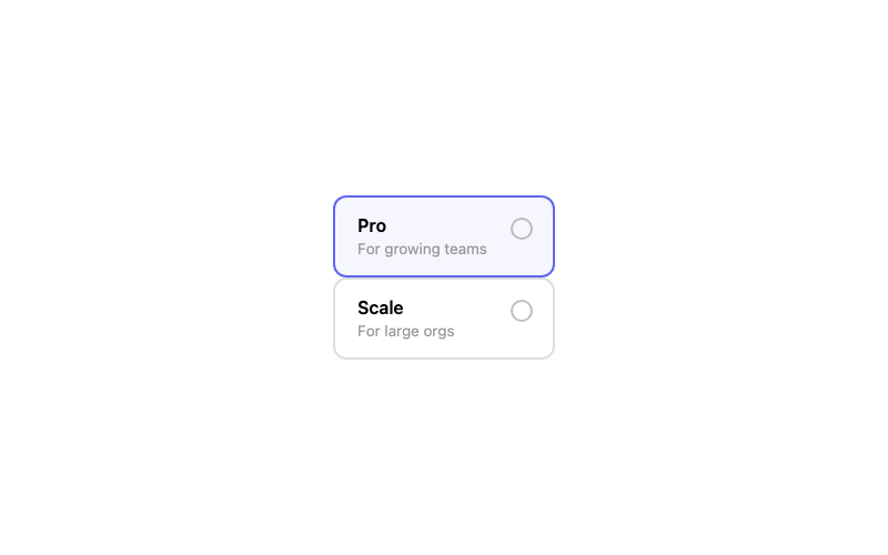
Radio Card
A selectable pricing card controlled by a radio.
htmlintermediate
2.2k1.5k374304
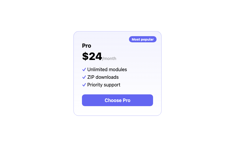 Featured
Pricing Card
A pricing card with a highlighted 'popular' tier.
htmlintermediate
2.5k583323393
 Featured
React Glass Navbar
A frosted-glass navbar as a React component.
reactintermediate
7.8k2.7k1.4k513

React Animated Counter
A hook-powered count-up component.
reactintermediate
2.9k4.3k852702