HTML modules
Plain HTML/CSS/JS
145 modules
Minimal Button
A clean, borderless button with a subtle fill on hover.
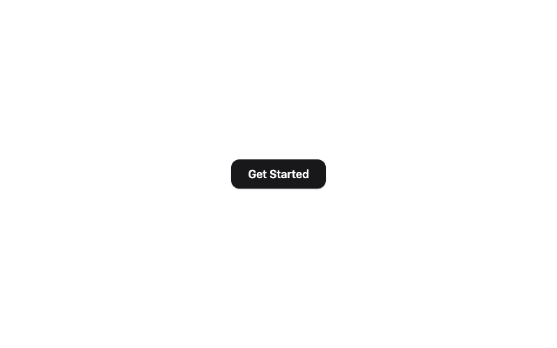
Modern Button
A rounded button with a soft shadow that lifts on hover.
 Featured
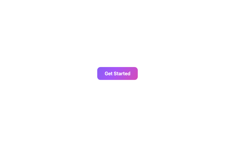
Animated Gradient Button
A button with a flowing animated gradient background.

Glass Button
A frosted-glass button with a backdrop blur and border highlight.
 Featured
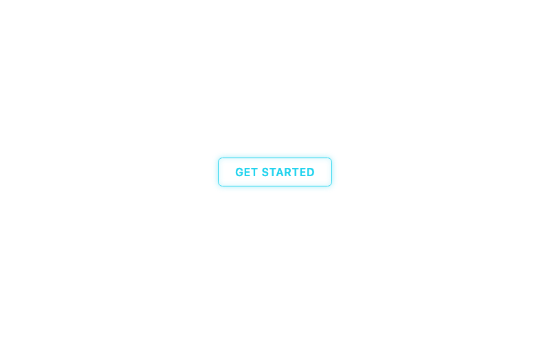
Neon Button
A glowing neon sign button with hover glow.
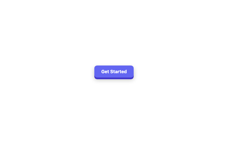
3D Button
A chunky 3D button with a pressed-down active state.
 Featured
Magnetic Button
A button that magnetically follows the cursor.
Loading Button
A button that shows a spinner and disables while pending.
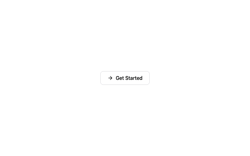
Icon Button
A button with an arrow icon that slides on hover.
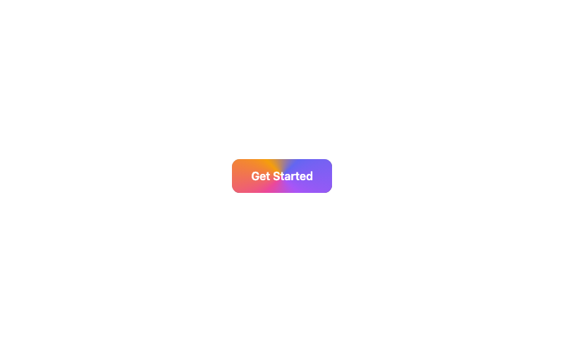
Animated Border Button
A button with a rotating conic-gradient border.
Ghost Button
A borderless button that fills softly on hover.
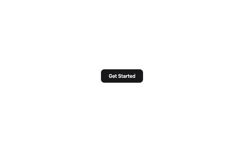
Shine Button
A button with a sweeping shine highlight on hover.
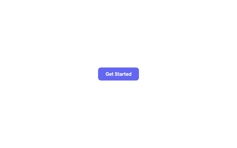
Ripple Button
A material-style button with a click ripple effect.
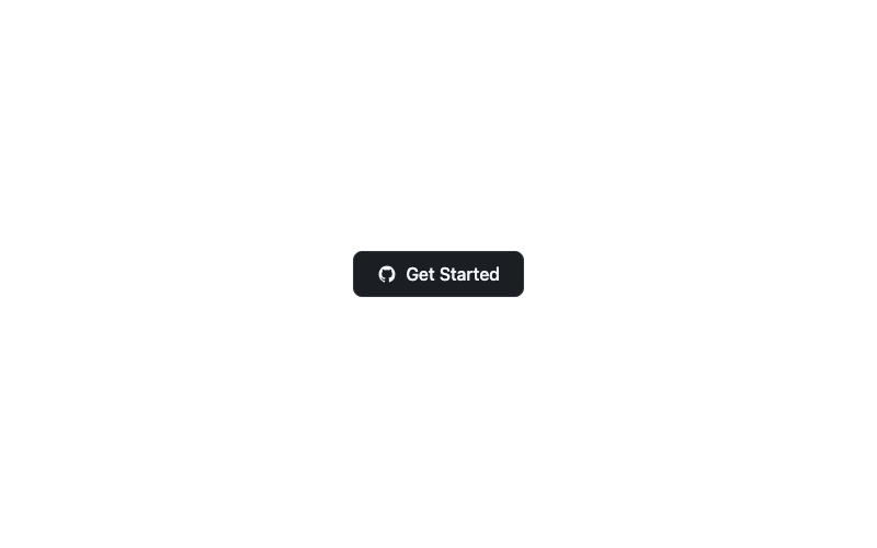
Social GitHub Button
A GitHub-branded button with the octocat mark.
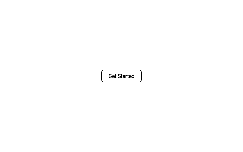
Outline Button
A classic outlined button with a filled hover state.
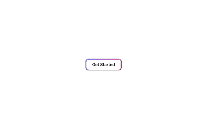
Gradient Border Button
A transparent button framed by a static gradient border.
Loading Skeleton Button
A skeleton placeholder button that appears to load.
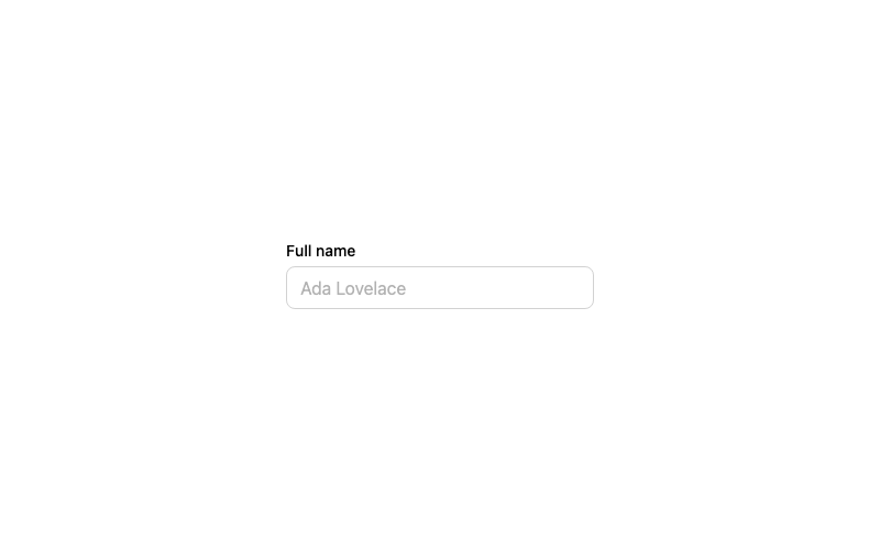
Default Input
A standard labeled text input with a focus ring.
 Featured
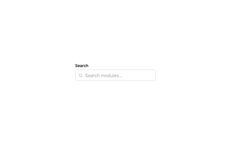
Icon Input
A search input with a leading magnifier icon.
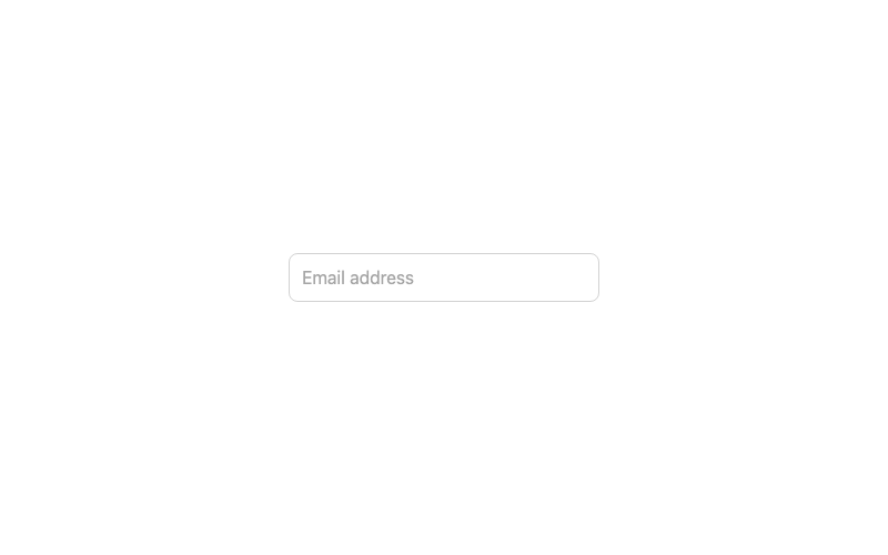
Floating Label Input
An input whose label floats above when focused or filled.
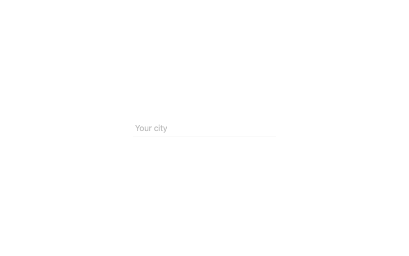
Underline Input
A borderless input with an animated underline.
 Featured
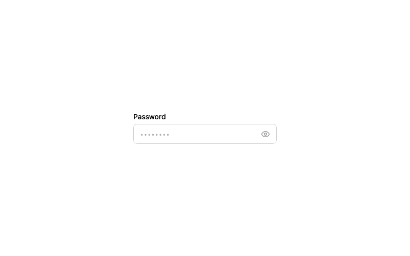
Password Toggle Input
A password field with a show/hide eye toggle.
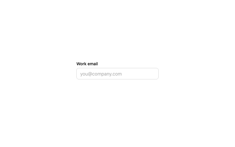
Validated Email Input
An email field with live validation feedback.
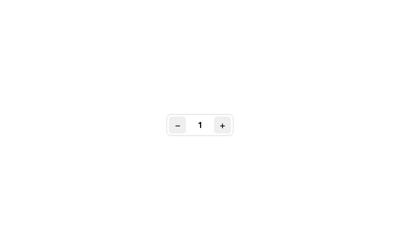
Number Stepper
A quantity input with plus/minus buttons.
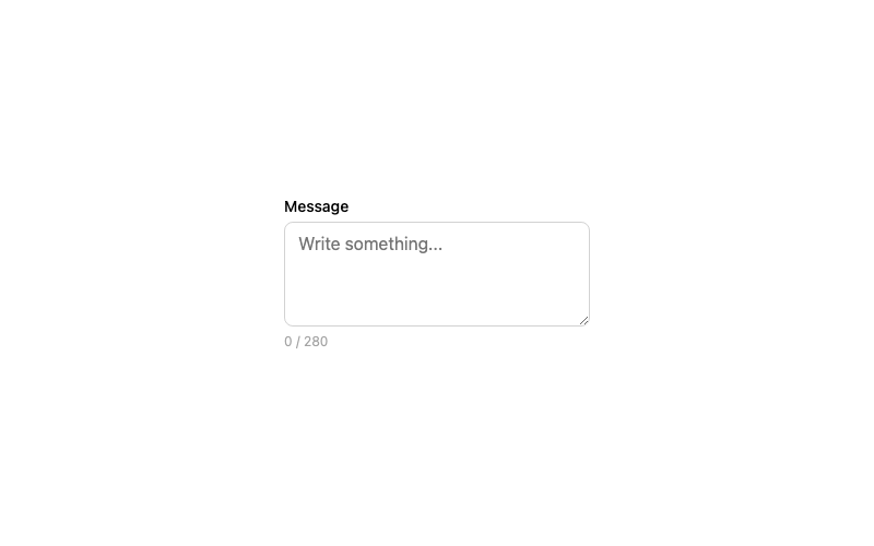
Textarea
A resizable textarea with character counter.
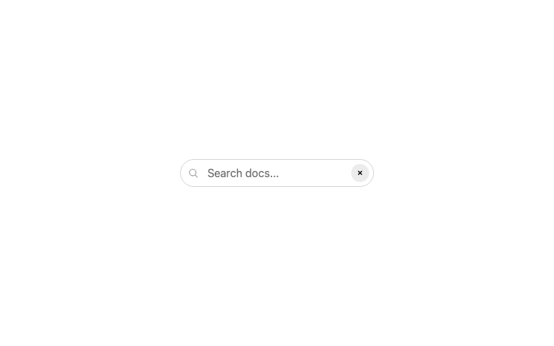
Clearable Search Input
A search input with a one-click clear button.
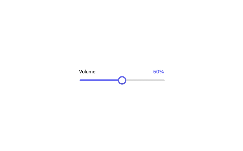
Range Slider
A styled range slider with a live value readout.
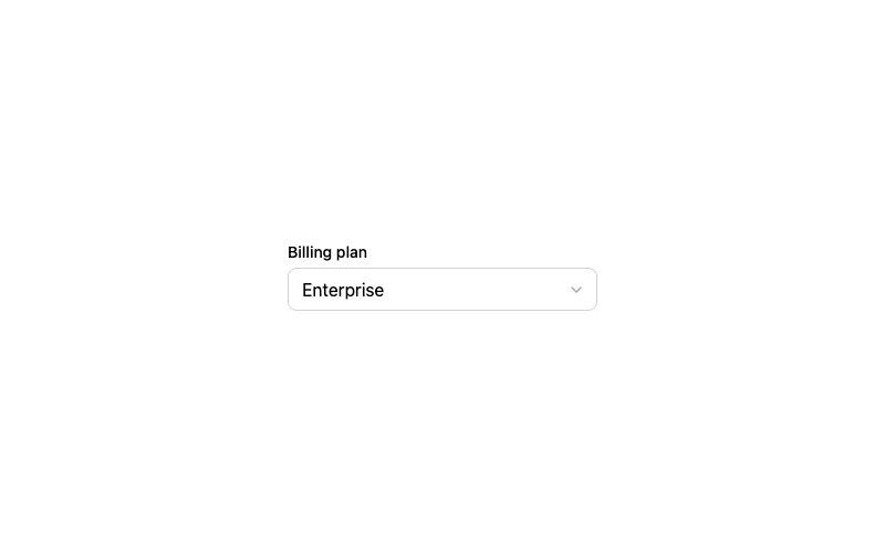
Custom Select
A styled dropdown select with a chevron.
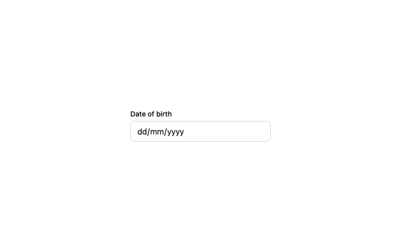
Date Input
A styled native date picker input.
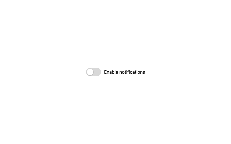
Classic Toggle
The standard green toggle switch with a sliding knob.
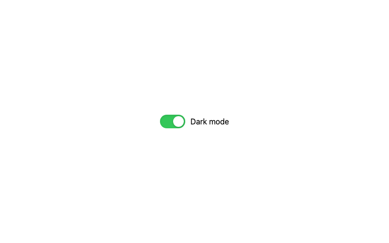
iOS Style Toggle
The pill-shaped iOS toggle with an inset shadow.
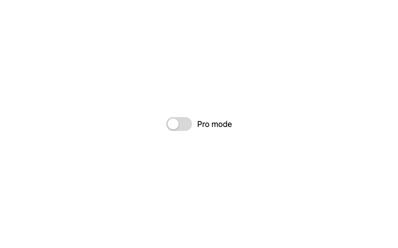
Gradient Toggle
A toggle with a vivid gradient fill when enabled.
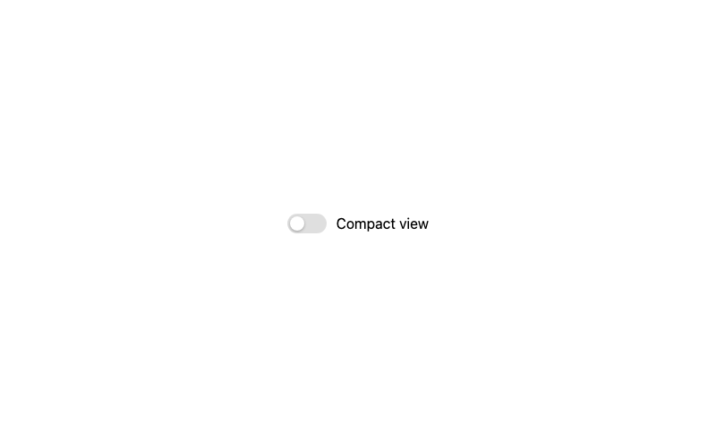
Minimal Toggle
A quiet, low-contrast toggle for toolbar UIs.
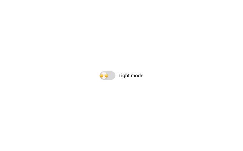
Emoji Toggle
A playful toggle whose knob shows an emoji.
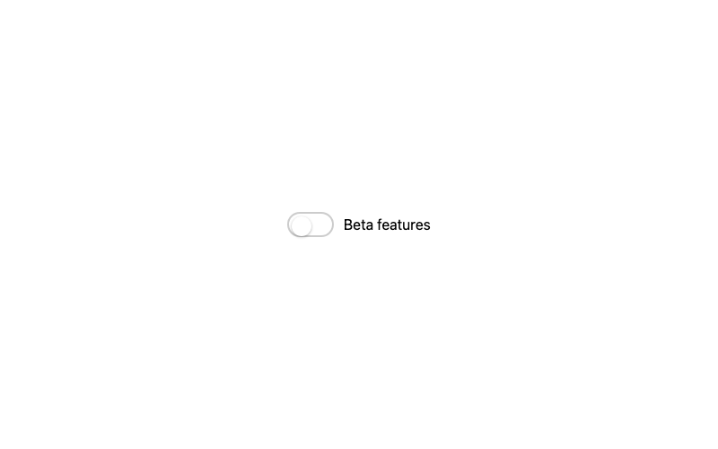
Border Toggle
A toggle outlined with a soft border, filled on check.
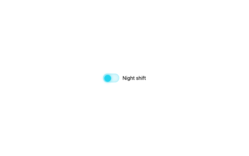
Neon Toggle
A glowing neon toggle for dark UIs.
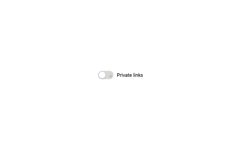
Icon Toggle
A toggle that shows an icon inside the track.
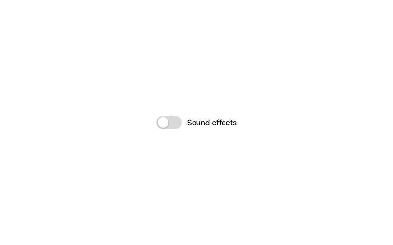
Animated Knob Toggle
A toggle with a bouncy spring knob animation.
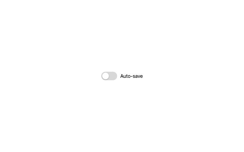
Scale Toggle
A compact toggle that scales up when focused.
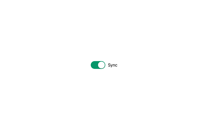
Solid Color Toggle
A bold toggle with a saturated on-state.
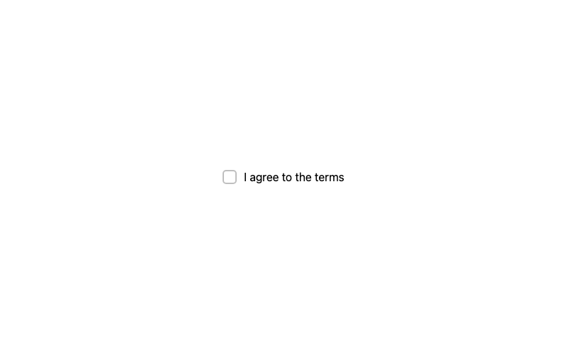
Default Checkbox
A standard checkbox with a crisp checkmark.
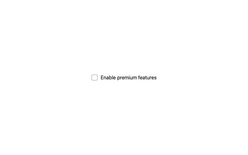
Gradient Checkbox
A checkbox that fills with a gradient when selected.
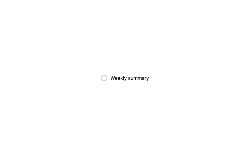
Rounded Checkbox
A fully circular checkbox.
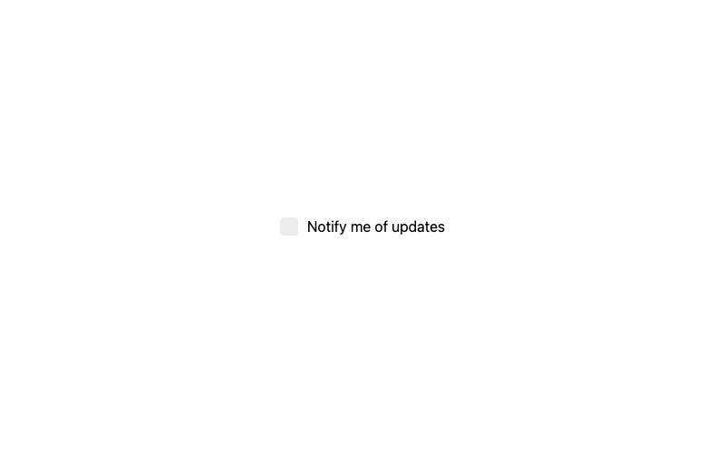
Minimal Checkbox
A borderless checkbox that only shows on selection.
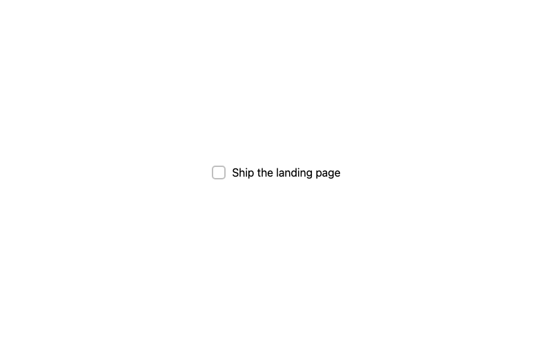
Label Strike Checkbox
A todo-style checkbox that strikes through its label.
Animated Pop Checkbox
A checkbox with a springy pop when selected.
Border Fill Checkbox
A checkbox that fills from a thin border.
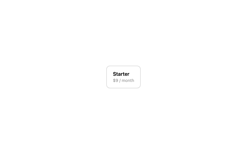
Checkbox Card
A selectable card with a checkmark in the corner.
Neon Checkbox
A glowing cyan checkbox for dark UIs.
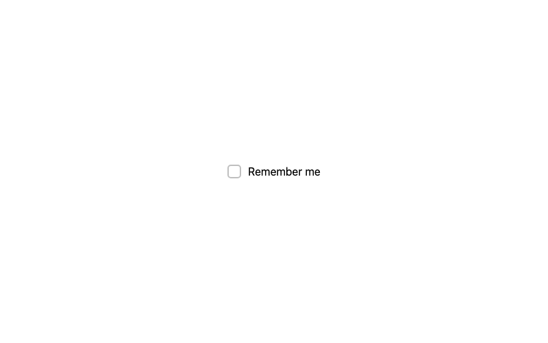
Hover Reveal Checkbox
A checkbox that previews its checkmark on hover.
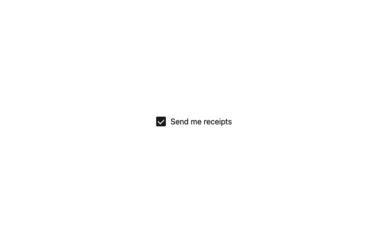
Outline Checkbox
A checkbox with a strong outline that inverts.
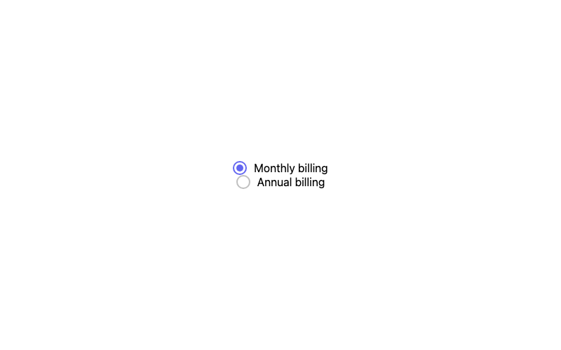
Default Radio
A standard radio button with a filled dot.
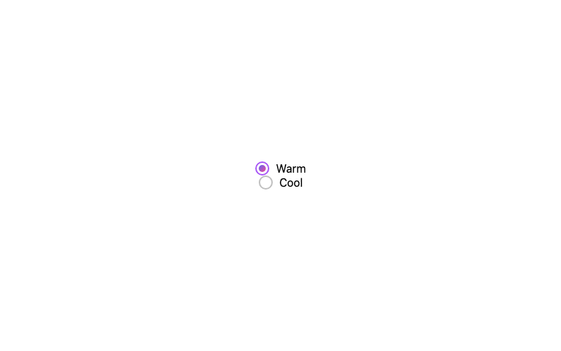
Gradient Radio
A radio whose selected dot is a gradient.
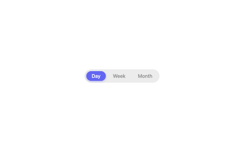
Pill Radio
Segmented-control pills that fill when selected.
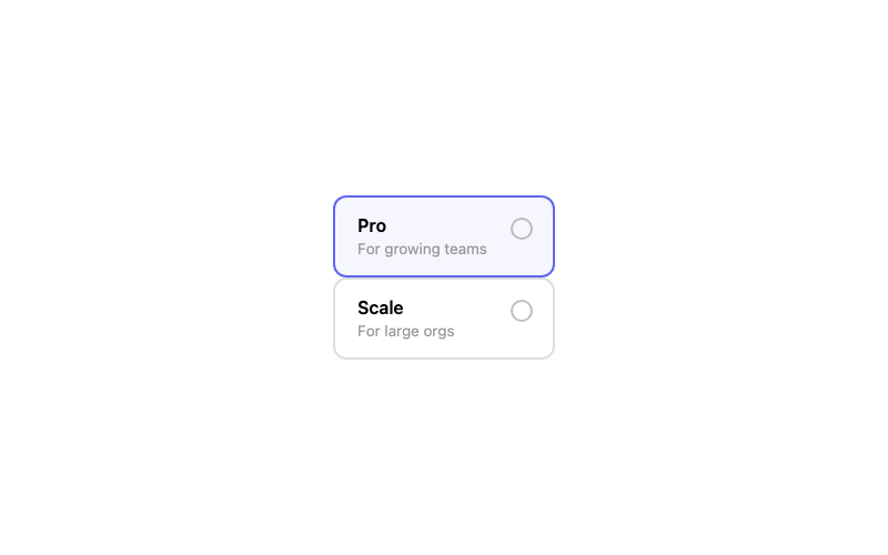
Radio Card
A selectable pricing card controlled by a radio.
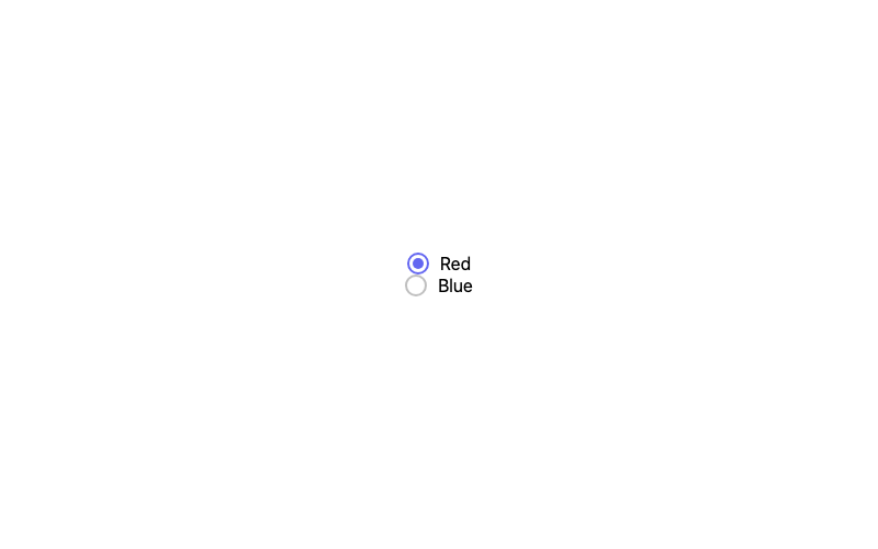
Animated Radio
A radio whose dot springs in when selected.
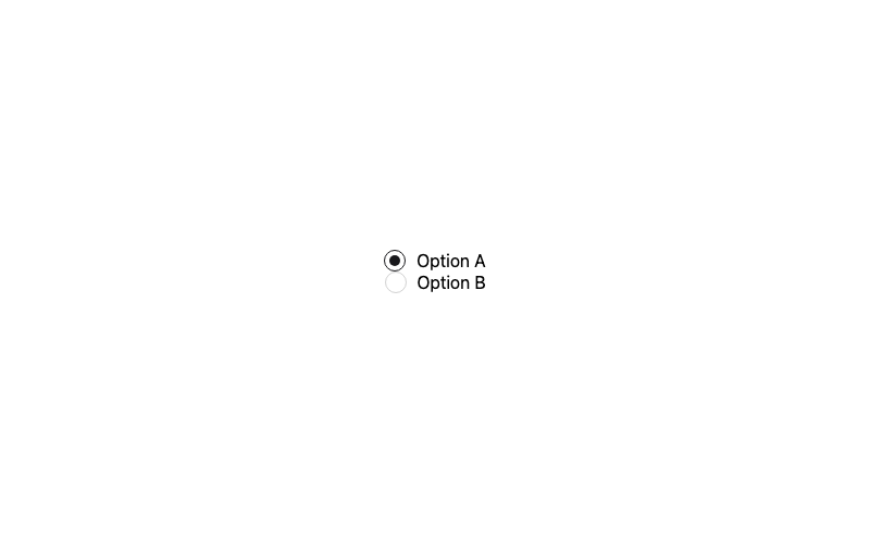
Minimal Radio
A quiet, low-contrast radio button.
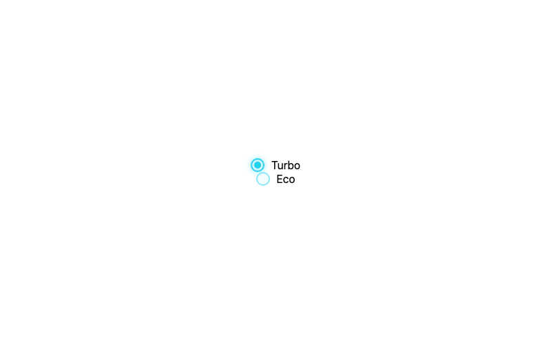
Neon Radio
A glowing cyan radio for dark interfaces.
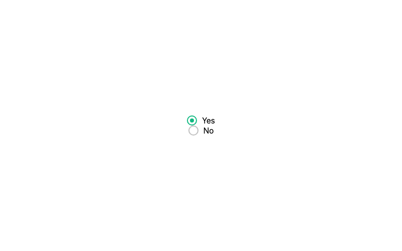
Border Radio
A radio that only uses its border to indicate state.
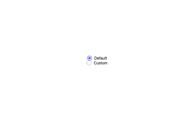
Hover Scale Radio
A radio that scales up slightly on hover.
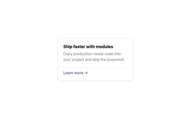
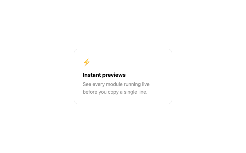
Simple Card
A clean card with title, body and a footer action.
 Featured
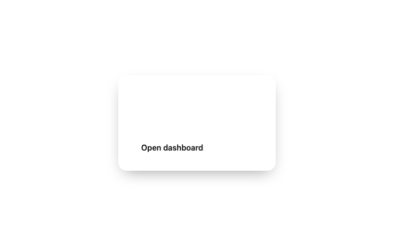
Hover Lift Card
A card that lifts and glows softly on hover.
Glass Card
A frosted glass card for overlays and heroes.
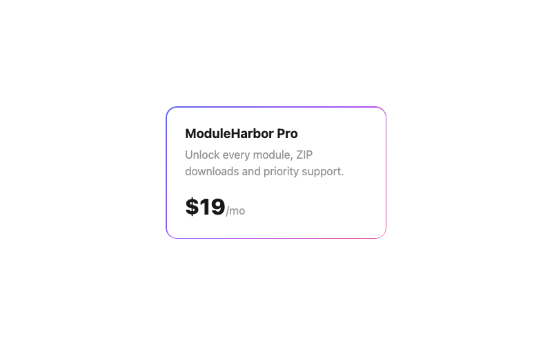
Gradient Border Card
A card framed by a vivid gradient border.
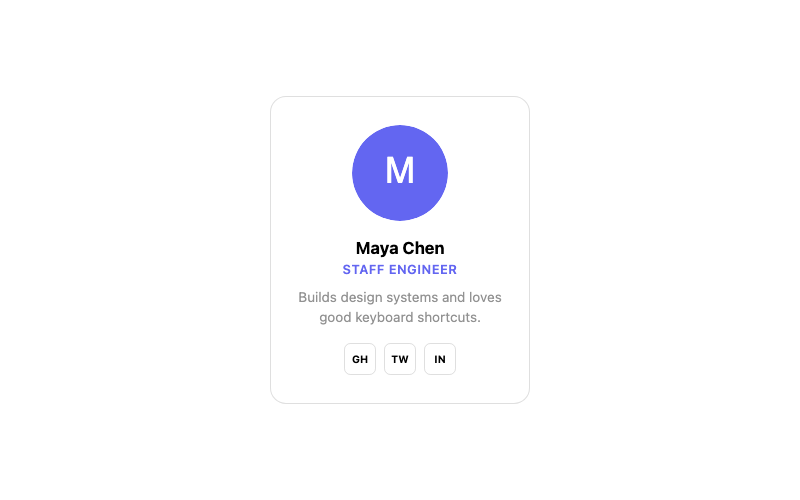
Profile Card
A team member card with avatar and social links.
 Featured
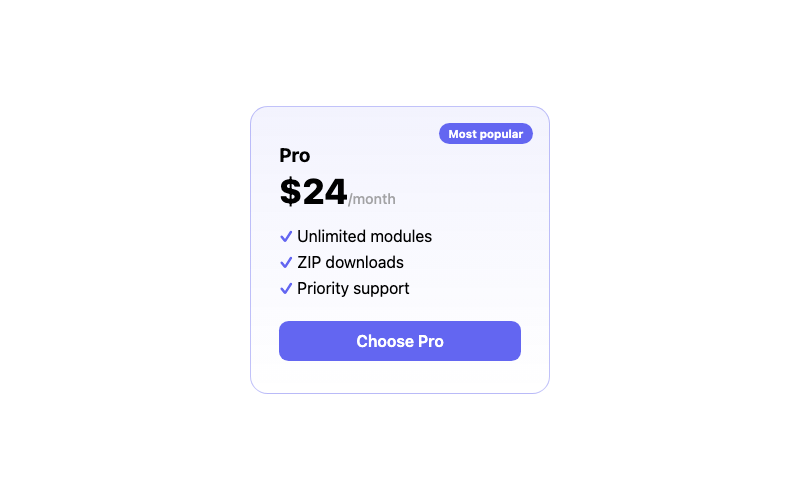
Pricing Card
A pricing card with a highlighted 'popular' tier.
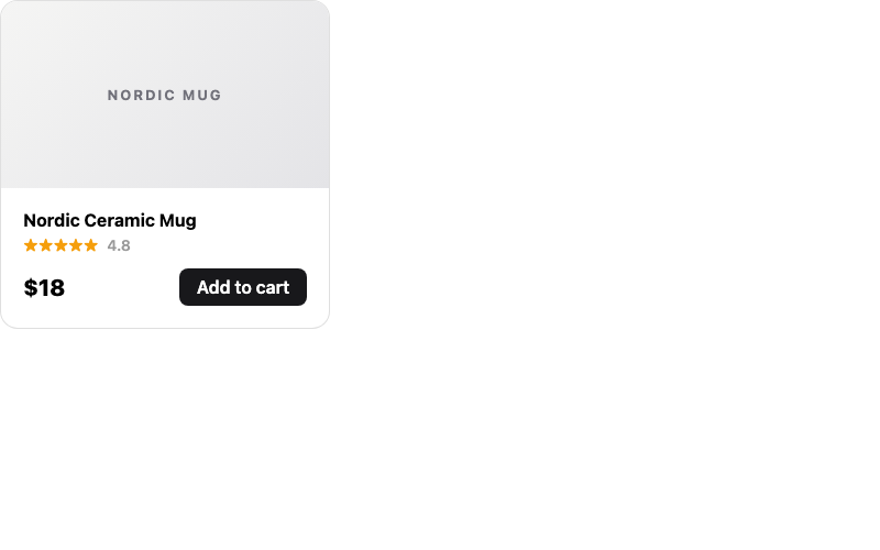
Product Card
An e-commerce product card with add-to-cart.
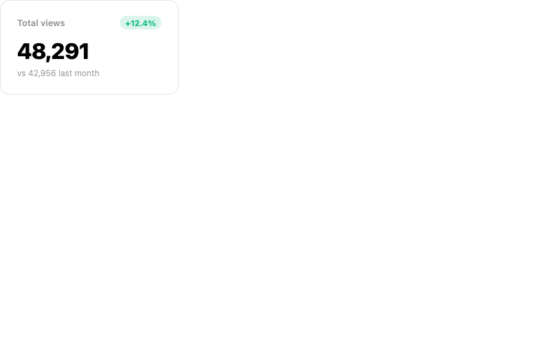
Stat Card
A dashboard stat card with trend indicator.
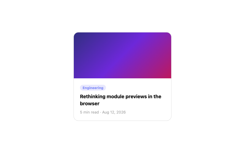
Blog Post Card
A blog card with thumbnail, meta and read time.
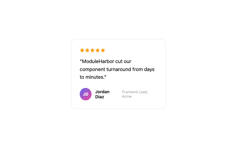
Testimonial Card
A quote card with author attribution and stars.
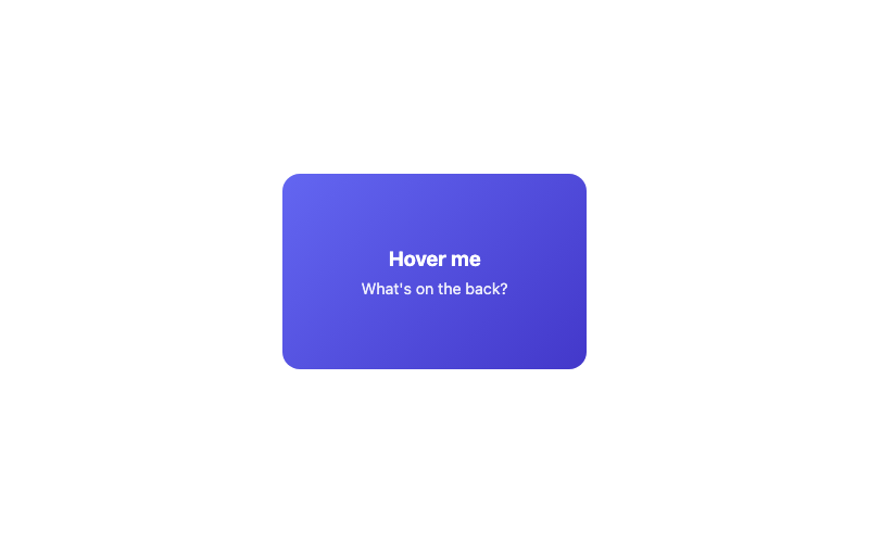
Flip Card
A card that flips to reveal content on the back.
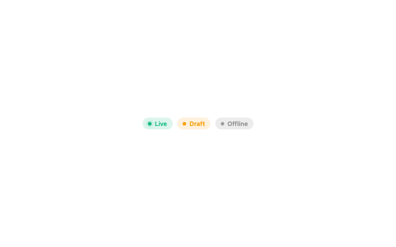
Status Badge
A pill badge for statuses with dot indicator.
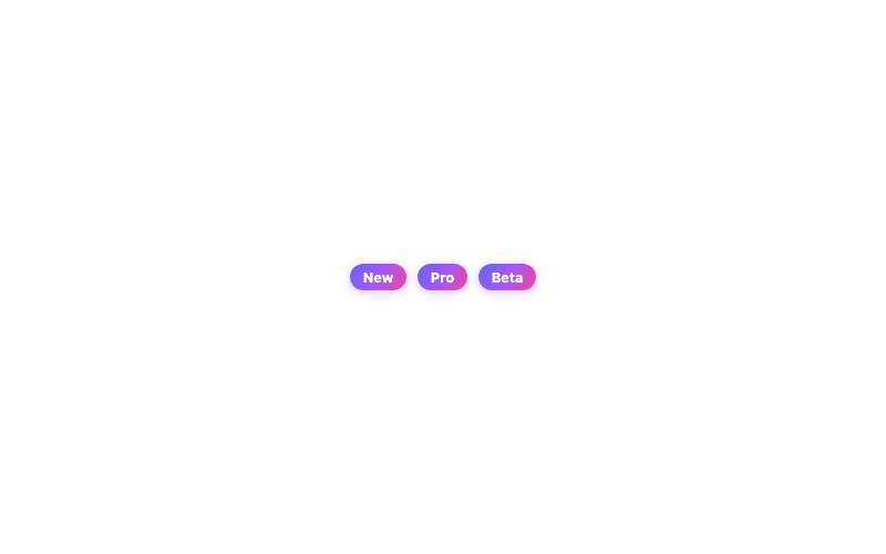
Gradient Badge
A vibrant gradient pill badge.
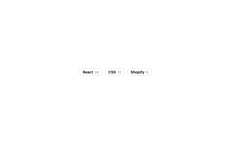
Outline Badge
A minimal outlined badge with count.
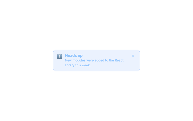
Info Alert
An informational alert banner with icon.
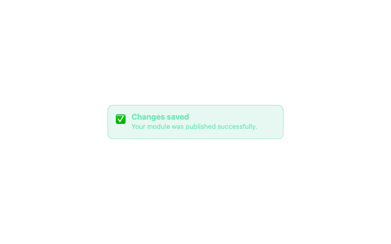
Success Alert
A success confirmation alert.
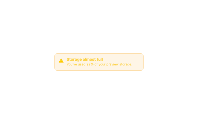
Warning Alert
A warning alert for cautionary messages.
Spinning Ring Loader
A classic circular spinner.
Dots Loader
Three bouncing dots.
Shimmer Bar Loader
An indeterminate progress bar.
Pulse Loader
A pulsing orb loader.
Text Loader
Animated ellipsis text loader.
 Featured
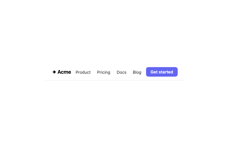
Sticky Navbar
A clean navbar that sticks to the top.
Glass Navbar
A frosted-glass navbar for dark heroes.
 Featured
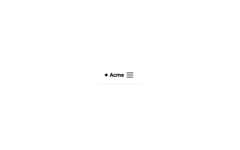
Mobile Menu
A hamburger menu that expands a drawer.
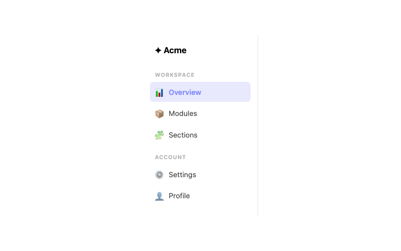
Sidebar
A vertical navigation sidebar with active state.
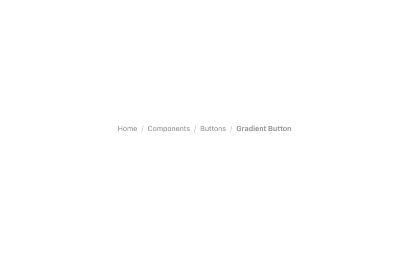
Breadcrumb
A breadcrumb trail with separators.
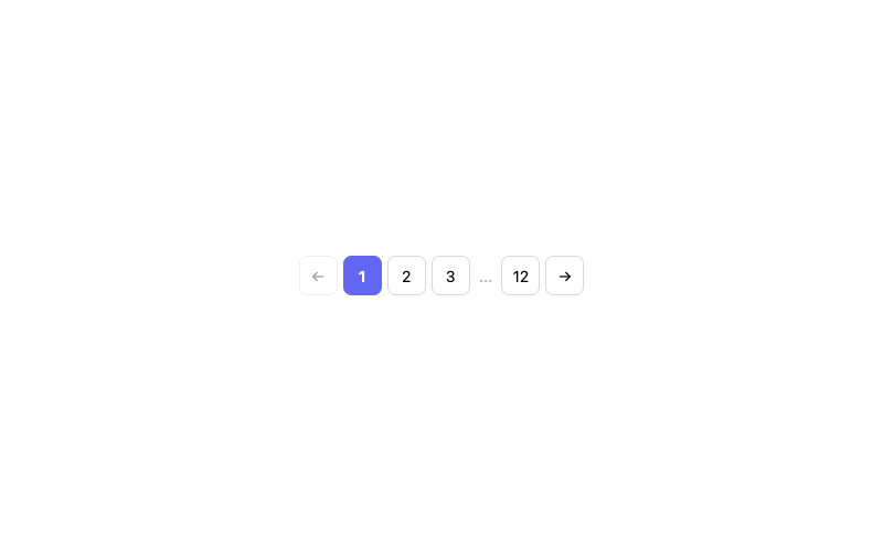
Pagination
A pagination control with active page.
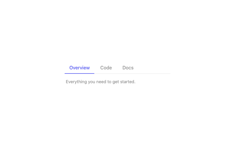
Tabs
Animated underline tabs with ARIA roles.
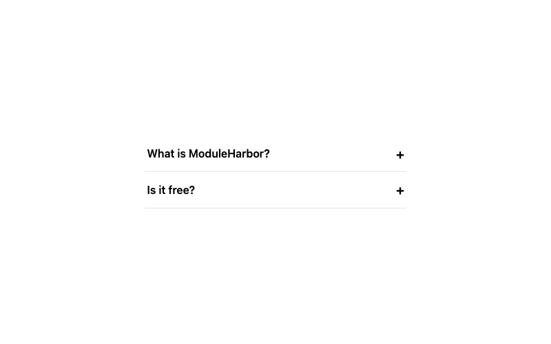
Accordion
A smooth expanding accordion (FAQ-style).
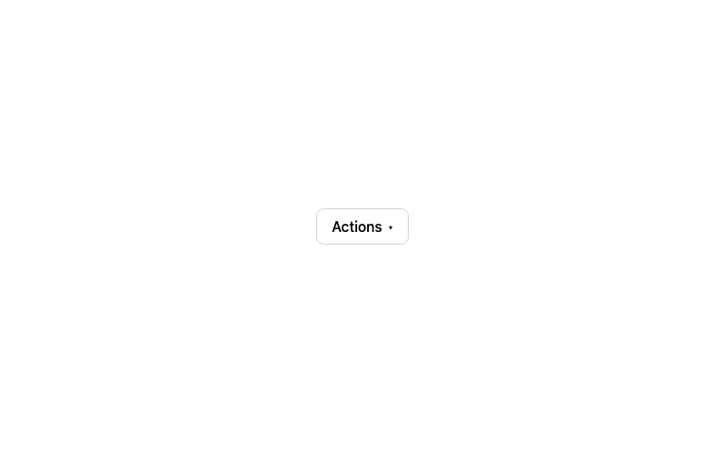
Dropdown Menu
A click-to-open dropdown menu.
Tooltip
A pure-CSS hover tooltip.
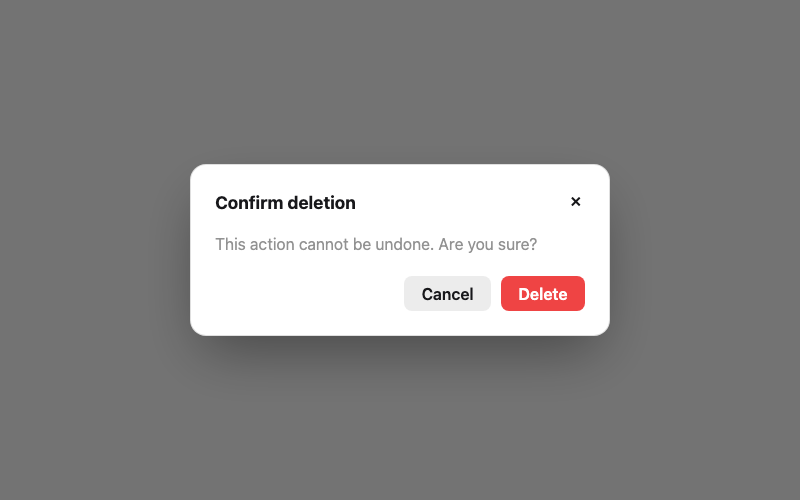
Modal Dialog
An accessible modal with focus trap basics.
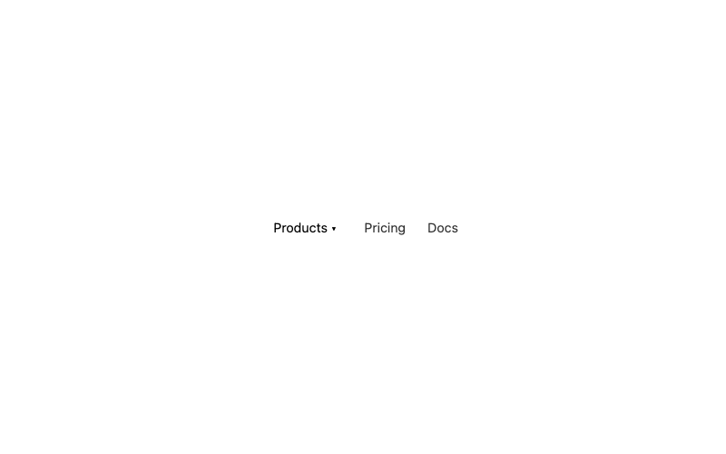
Mega Menu
A hover mega menu with grouped columns.
 Featured
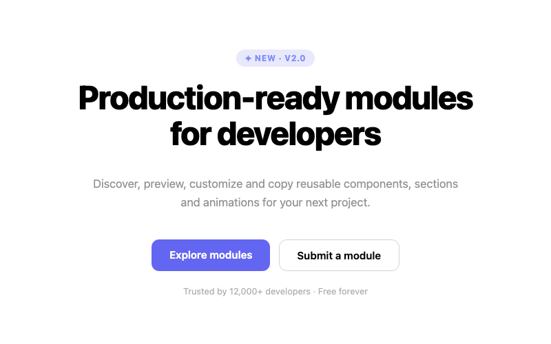
Centered Hero
A centered headline hero with dual CTAs.
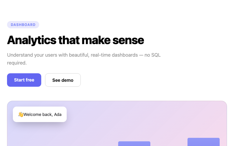
Split Hero
A two-column hero with copy and a visual panel.

Gradient Hero
A hero with an animated gradient background.
 Featured
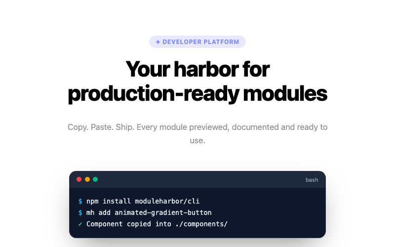
Terminal Hero
A developer hero featuring a terminal window.
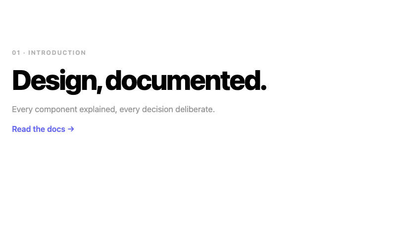
Minimal Hero
A restrained hero with lots of breathing room.
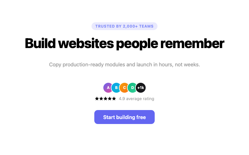
Hero with Social Proof
A hero with an avatar stack and rating line.
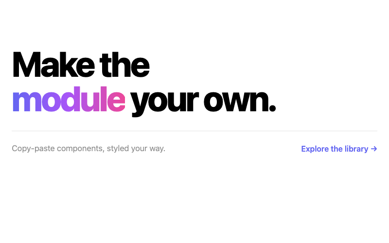
Big Typography Hero
A hero dominated by oversized display type.
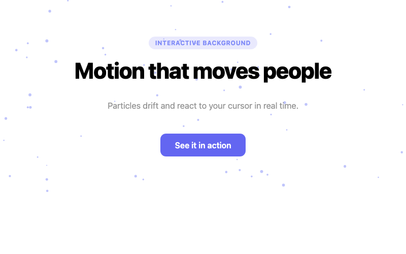
Animated Background Hero
A hero with a canvas particle background.
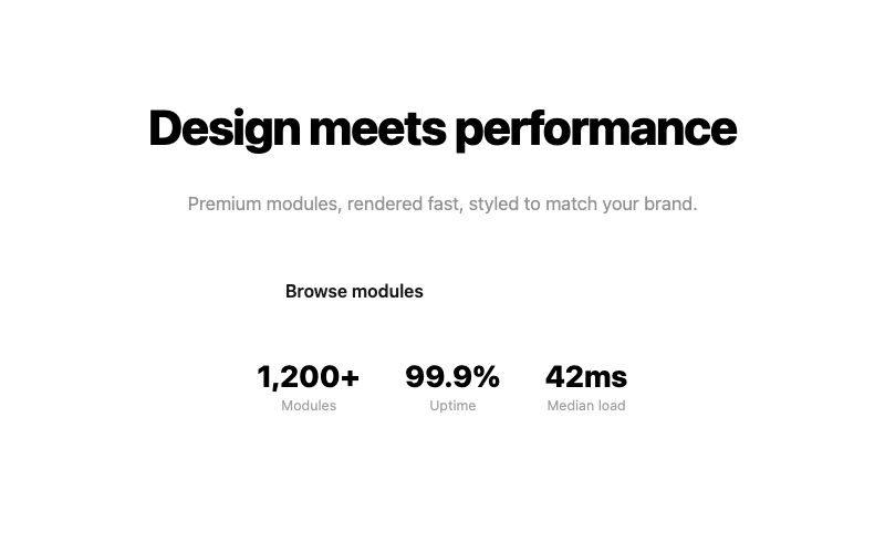
Glass Hero
A hero with frosted-glass text panels.
 Featured
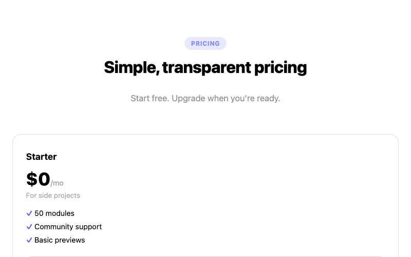
Three Tier Pricing
A three-column pricing grid with a highlighted plan.
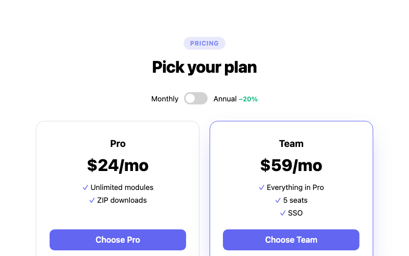
Billing Toggle Pricing
A pricing section with a monthly/annual toggle.
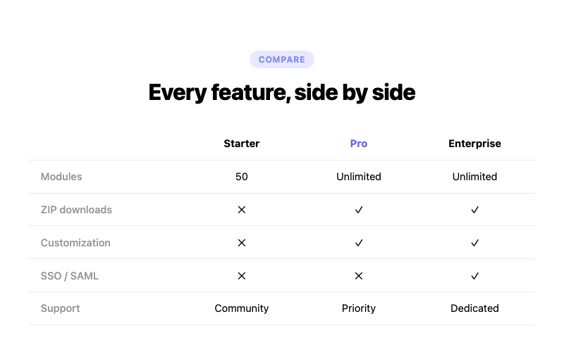
Comparison Pricing
A feature comparison table with check marks.
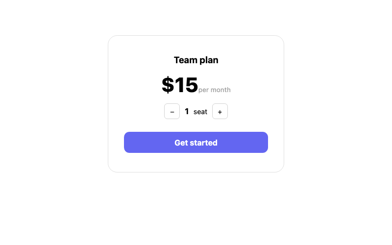
Per Seat Pricing
A pricing card with a seat stepper.
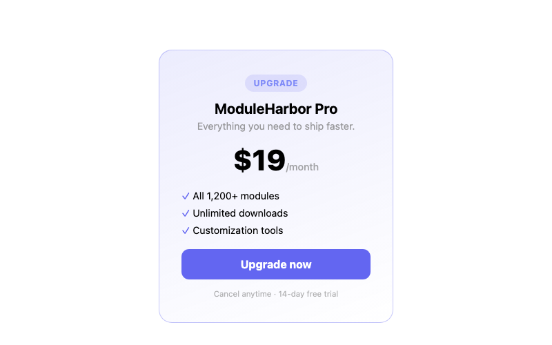
Inline Pricing Card
A compact single pricing card.
 Featured
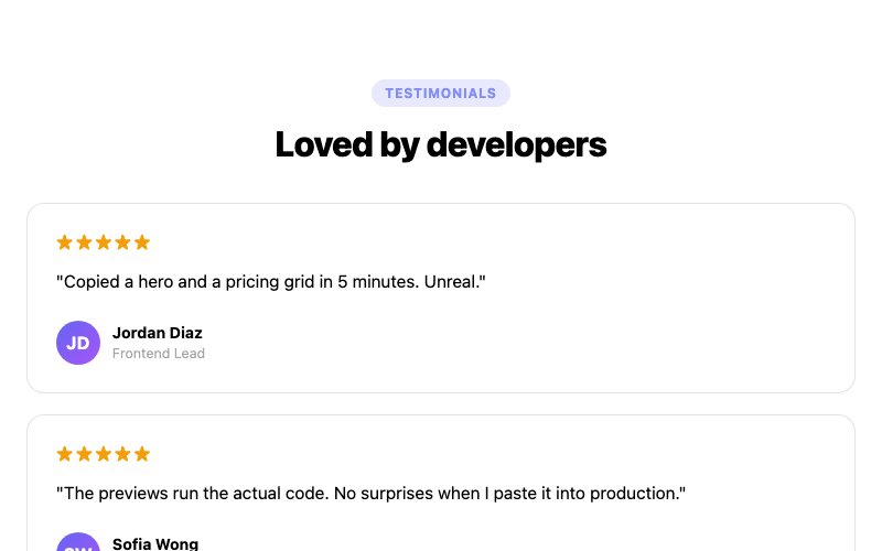
Testimonial Grid
A masonry-style testimonial grid.
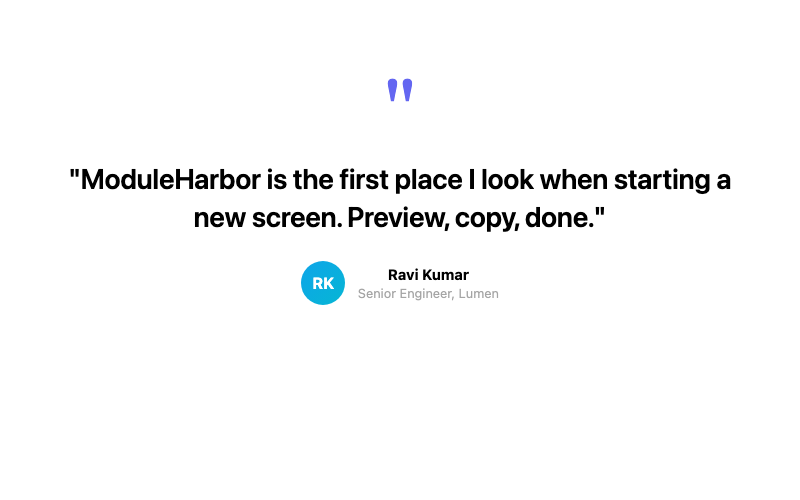
Single Featured Testimonial
A large centered pull-quote testimonial.
Logo Marquee + Testimonial
A testimonial with a scrolling logo strip.
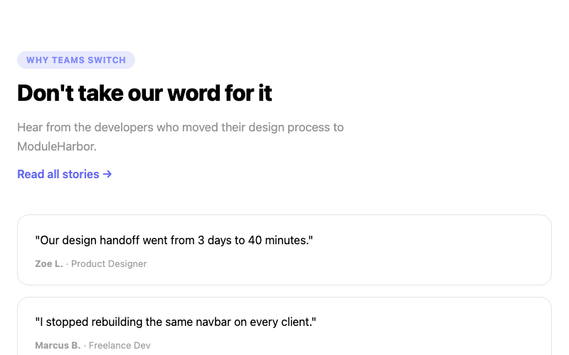
Two Column Testimonials
A split layout with a headline and testimonials.
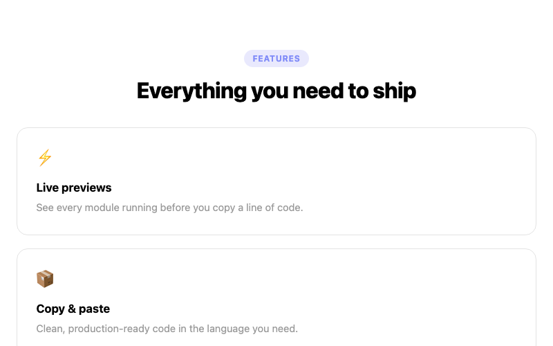
Features Grid
A three-column feature grid with icons.
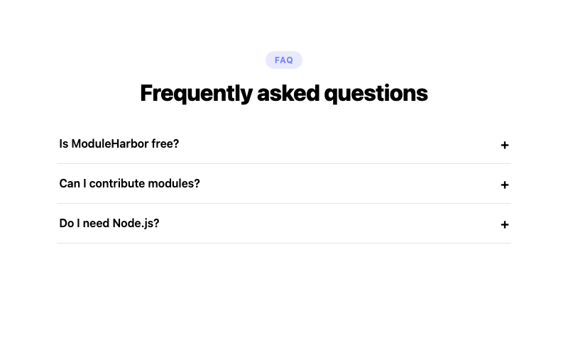
FAQ Accordion Section
A full FAQ section with accordions.
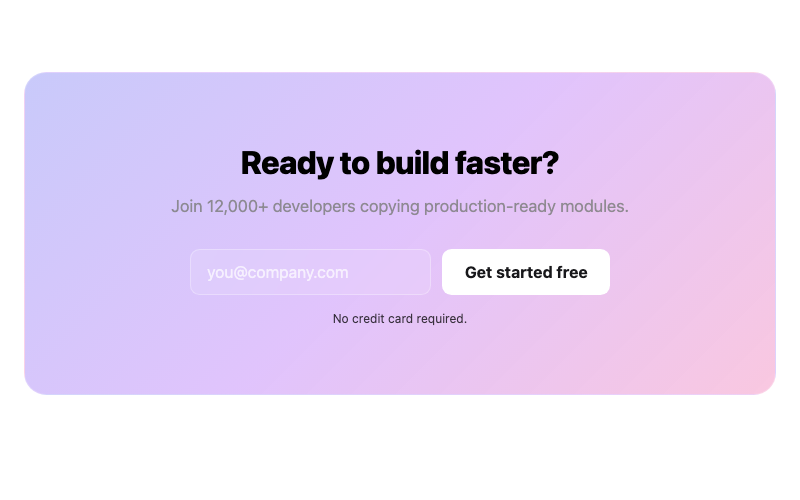
CTA Banner
A gradient CTA banner with email capture.
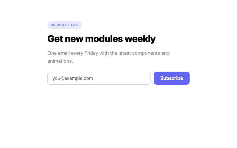
Newsletter Section
A newsletter signup with success state.
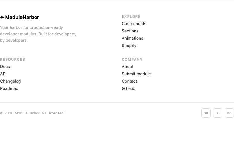
Modern Footer
A multi-column footer with newsletter link.
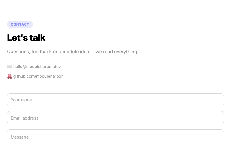
Contact Section
A contact form with floating labels.
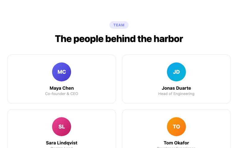
Team Section
A team grid with member cards.
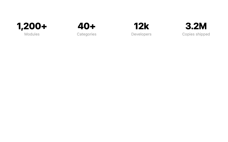
Stats Section
A metrics strip with big numbers.
Fade In Up
Content that fades and rises into place.
Floating Element
An element that gently floats up and down.
Pulsing Glow
A soft expanding glow ring.
 Featured
Gradient Shift Text
Text with a flowing gradient fill.
Shimmer Text
A sweeping shine across text.
 Featured
Typewriter Effect
A typewriter that types and deletes.
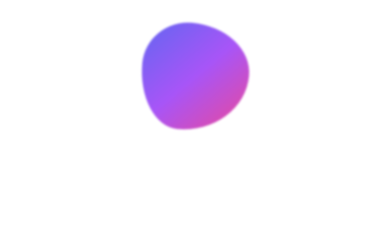
Blob Morph
An organic morphing blob shape.
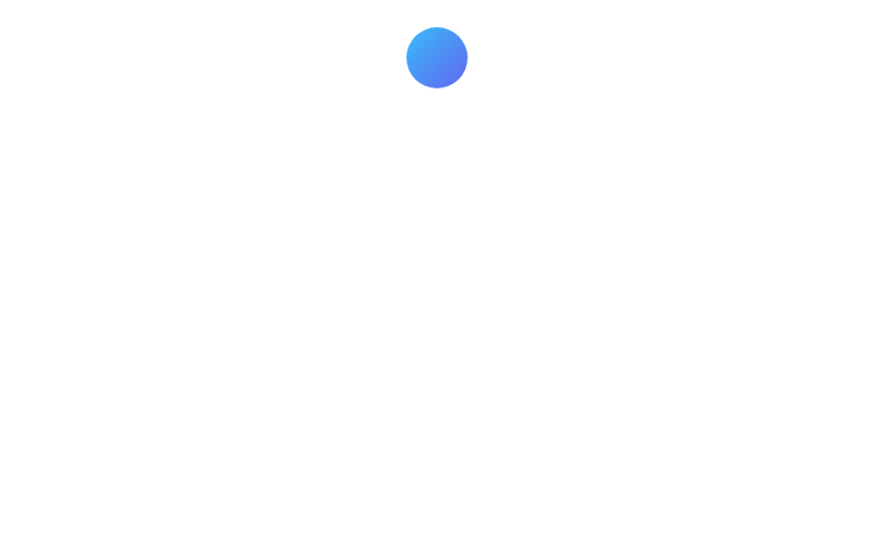
Bouncing Ball
A ball that bounces with squash and stretch.
Hover Icon Shake
An icon that shakes on hover.

Skeleton Shimmer
A shimmering skeleton placeholder block.
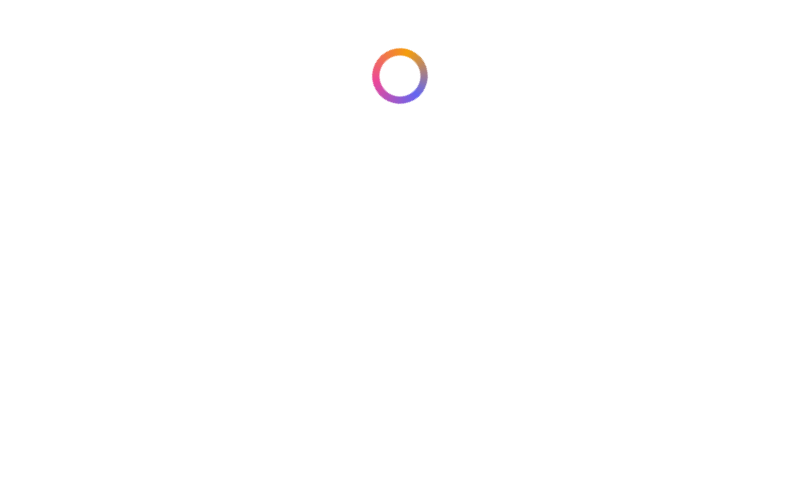
Conic Spin Ring
A rotating conic-gradient ring.
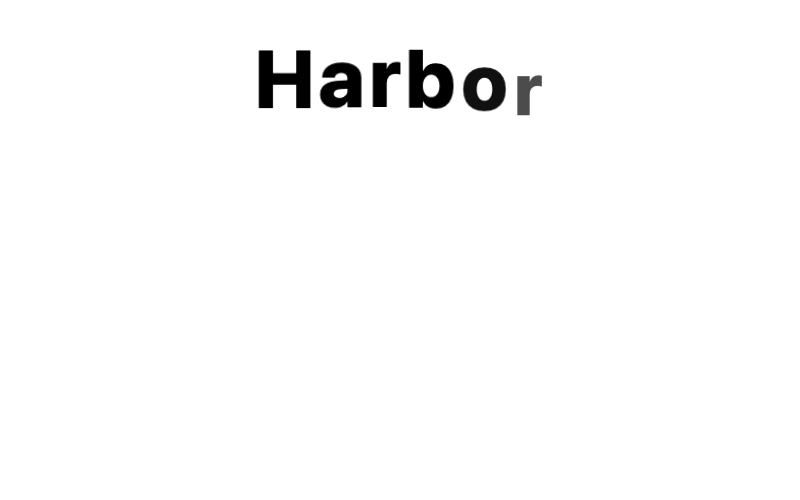
Letter Stagger
Letters that pop in one by one.
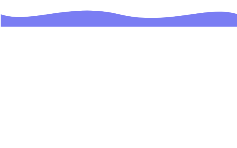
Wave Divider
An SVG wave that gently undulates.
 Featured
Particle Field
A drifting field of connected particles.
Mouse Trail Particles
Particles that chase the cursor.
Starfield
A twinkling starfield with depth.
Fluid Waves
Animated layered sine waves.
Fireworks
Automatic exploding fireworks.
Ripple Rings
Expanding rings that ripple outward.
 Featured
Stagger Reveal
Items fade up in a GSAP stagger.
Text Split Effect
Characters animate in one by one.
 Featured
GSAP Magnetic Button
A button that magnetically follows the cursor.
Number Counter
Numbers count up when they appear.
Mouse Parallax
Layered elements parallax with the cursor.
Rotating Badge
A circular badge that spins around itself.