htmlbeginnermit
Info Alert
An informational alert banner with icon.
1.3k1.2k169279
About this module
A soft info alert with an icon and a dismissible close button.
#alert#info#banner
Source code
Installation
- 1
Create the files
Create `index.html` and `style.css` in the same folder.
- 2
Paste the code
Copy each file's source into its matching file.
- 3
Open in the browser
Open `index.html` in any modern browser.
Usage
- 1
Copy the HTML
Paste the card markup where you need it.
<link rel="stylesheet" href="style.css" /> <script src="script.js"></script> <div class="mh-alert info" role="alert"> <span class="mh-icon">ℹ️</span> <div> <b>Heads up</b> <p>New modules were added to the React library this week.</p> </div> <button class="mh-close" aria-label="Dismiss">×</button> </div> - 2
Wire up the script
Include `script.js` before the closing body tag.
document.querySelectorAll(".mh-close").forEach((btn) => {
  btn.addEventListener("click", () => btn.closest(".mh-alert").remove());
});
Related modules
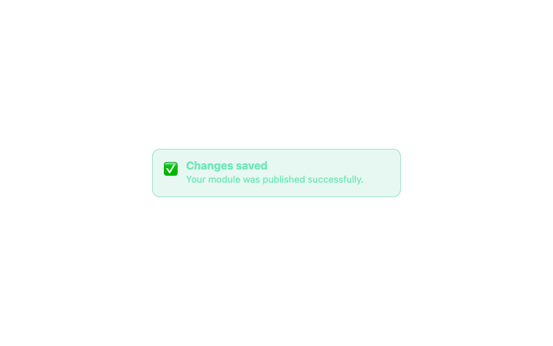
Success Alert
A success confirmation alert.
htmlbeginner
3.8k738478108
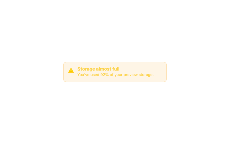
Warning Alert
A warning alert for cautionary messages.
htmlbeginner
1.6k1.3k27989
Minimal Button
A clean, borderless button with a subtle fill on hover.
htmlbeginner
4.8k2.0k48090
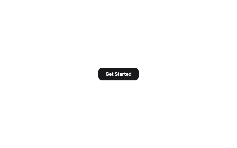
Modern Button
A rounded button with a soft shadow that lifts on hover.
htmlbeginner
4.6k81636676