htmlbeginnermit
Custom Select
A styled dropdown select with a chevron.
1.7k692492132
About this module
A `<select>` element styled with a custom chevron and hover states — accessible by default with zero JavaScript.
#input#form#select#dropdown
Source code
Installation
- 1
Create the files
Create `index.html`, `style.css` and (if listed) `script.js` in the same folder.
- 2
Paste the code
Copy each file's source into its matching file.
- 3
Open in the browser
Open `index.html` in any modern browser.
Usage
- 1
Copy the HTML
Paste the markup where you need it.
<link rel="stylesheet" href="style.css" />
<div class="mh-field">
  <label for="plan">Billing plan</label>
  <div class="mh-select-wrap">
    <select id="plan">
      <option>Starter</option>
      <option>Pro</option>
      <option selected>Enterprise</option>
    </select>
    <svg class="mh-chevron" width="16" height="16" viewBox="0 0 24 24" fill="none" stroke="currentColor" stroke-width="2" stroke-linecap="round"><path d="m6 9 6 6 6-6"/></svg>
  </div>
</div>
Related modules
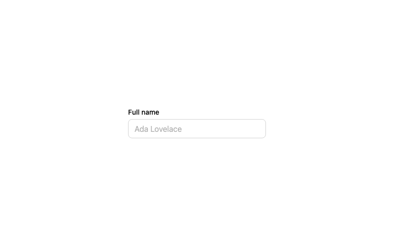
Default Input
A standard labeled text input with a focus ring.
htmlbeginner
2.9k874674314
 Featured
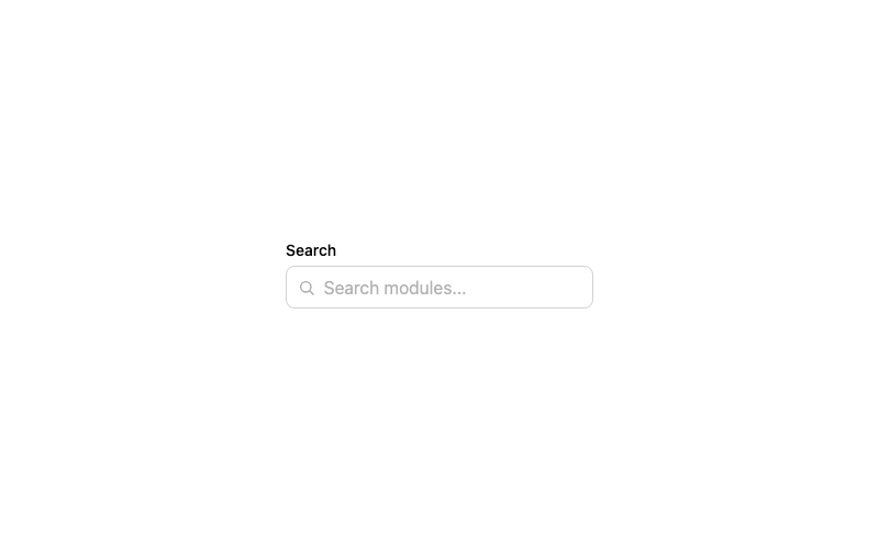
Icon Input
A search input with a leading magnifier icon.
htmlbeginner
1.3k802602242
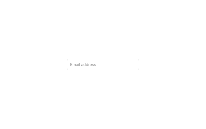
Floating Label Input
An input whose label floats above when focused or filled.
htmladvanced
3.2k1.0k246186
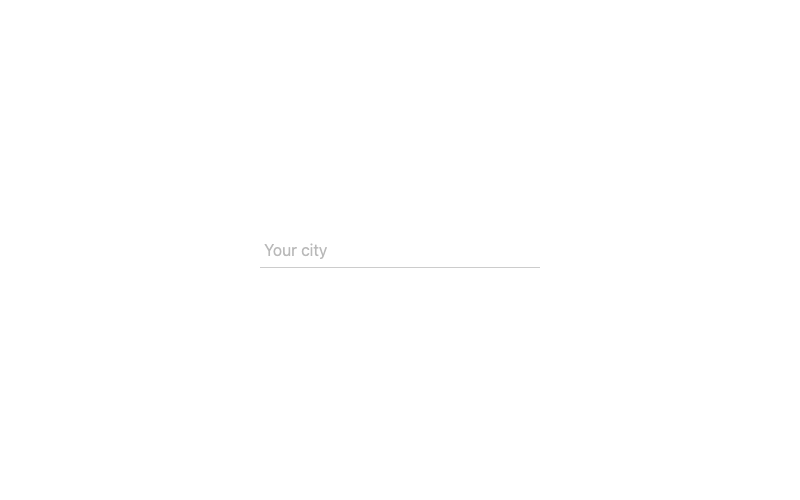
Underline Input
A borderless input with an animated underline.
htmlintermediate
2.2k62942969