Search the library
17+ production-ready modules. Find your next component.
17 modules
for “CSS button”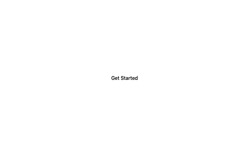
Minimal Button
A clean, borderless button with a subtle fill on hover.
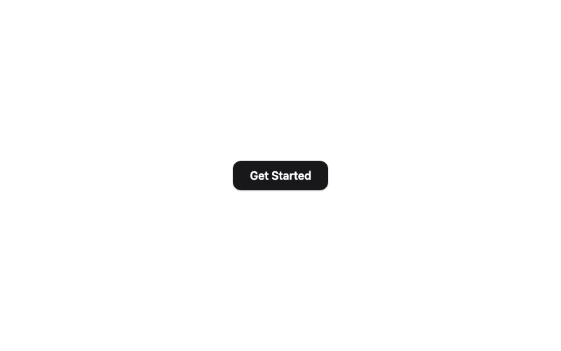
Modern Button
A rounded button with a soft shadow that lifts on hover.
 Featured
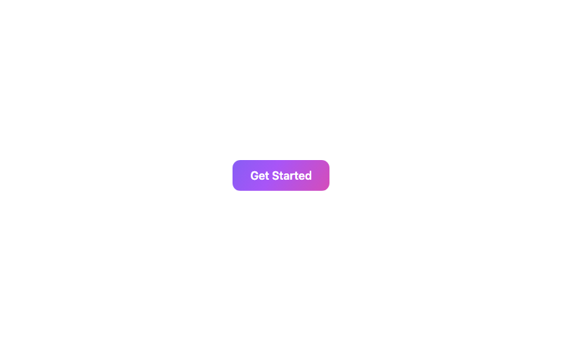
Animated Gradient Button
A button with a flowing animated gradient background.

Glass Button
A frosted-glass button with a backdrop blur and border highlight.
 Featured
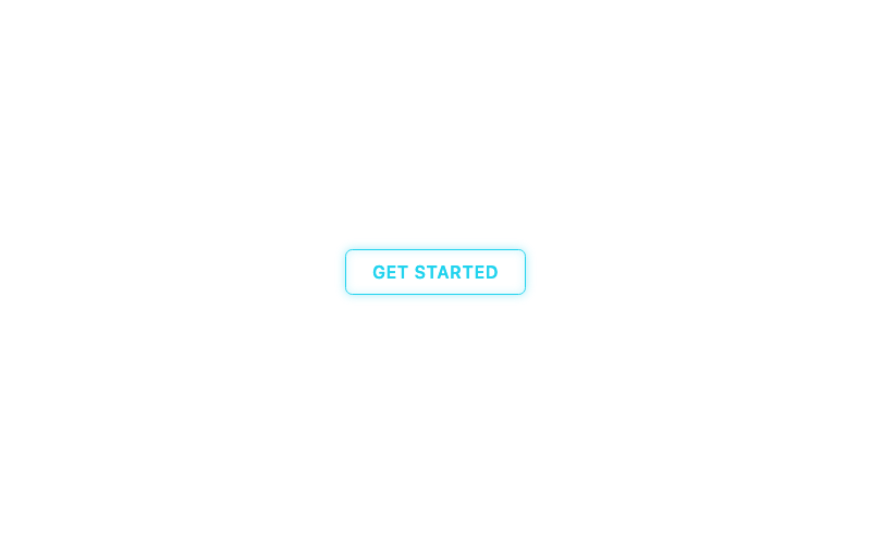
Neon Button
A glowing neon sign button with hover glow.
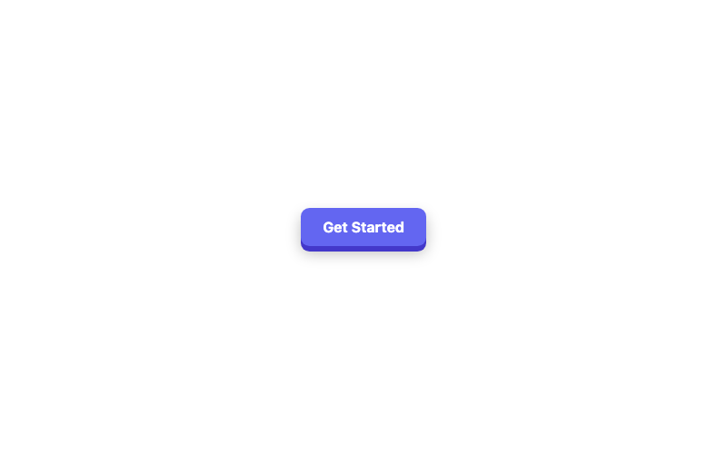
3D Button
A chunky 3D button with a pressed-down active state.
 Featured
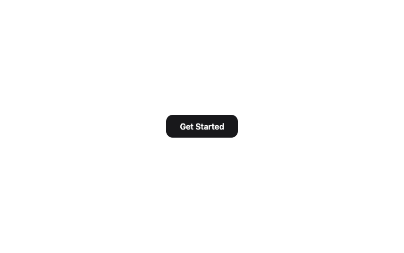
Magnetic Button
A button that magnetically follows the cursor.
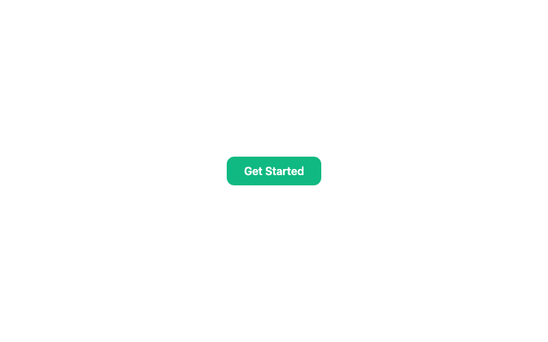
Loading Button
A button that shows a spinner and disables while pending.
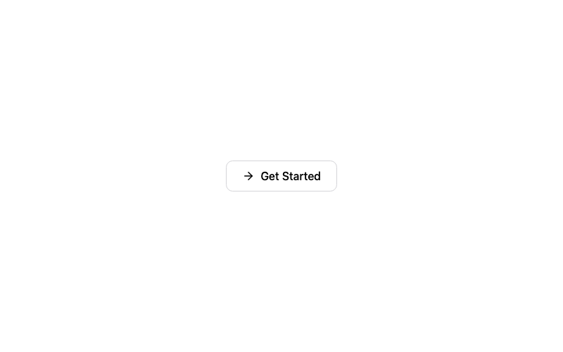
Icon Button
A button with an arrow icon that slides on hover.
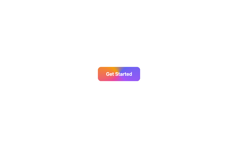
Animated Border Button
A button with a rotating conic-gradient border.
Ghost Button
A borderless button that fills softly on hover.
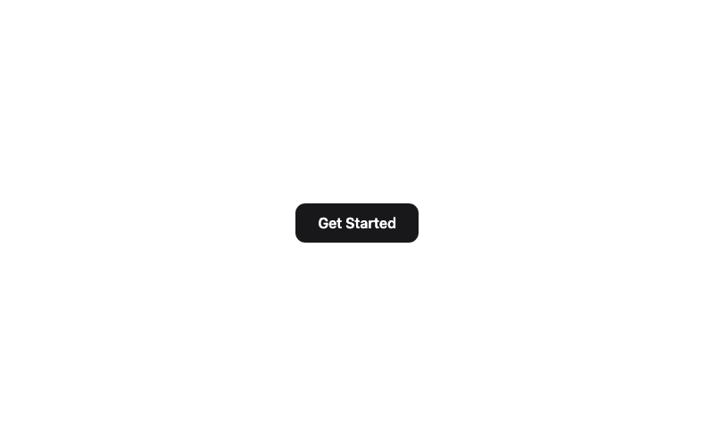
Shine Button
A button with a sweeping shine highlight on hover.
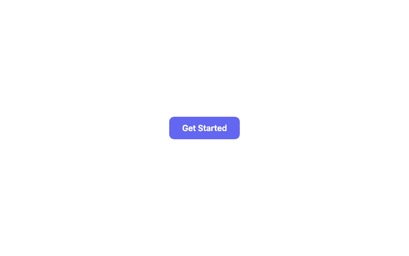
Ripple Button
A material-style button with a click ripple effect.
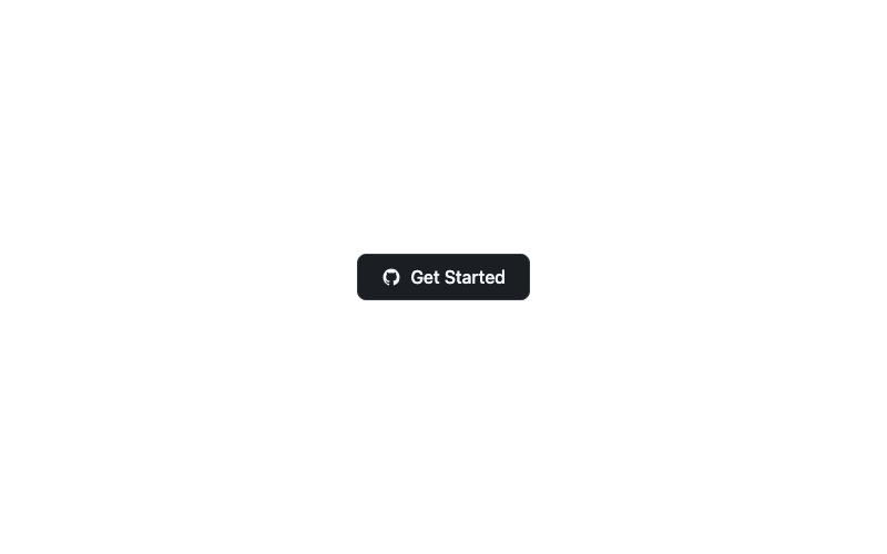
Social GitHub Button
A GitHub-branded button with the octocat mark.
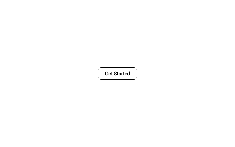
Outline Button
A classic outlined button with a filled hover state.
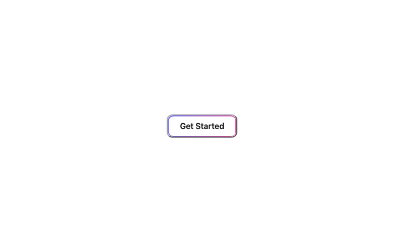
Gradient Border Button
A transparent button framed by a static gradient border.
Loading Skeleton Button
A skeleton placeholder button that appears to load.
You've reached the end — 17 modules shown.