Search the library
43+ production-ready modules. Find your next component.

Glass Button
A frosted-glass button with a backdrop blur and border highlight.
 Featured
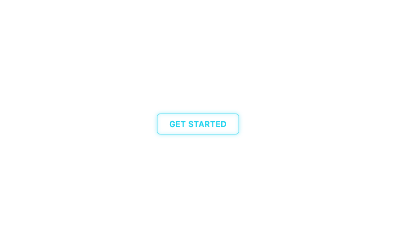
Neon Button
A glowing neon sign button with hover glow.
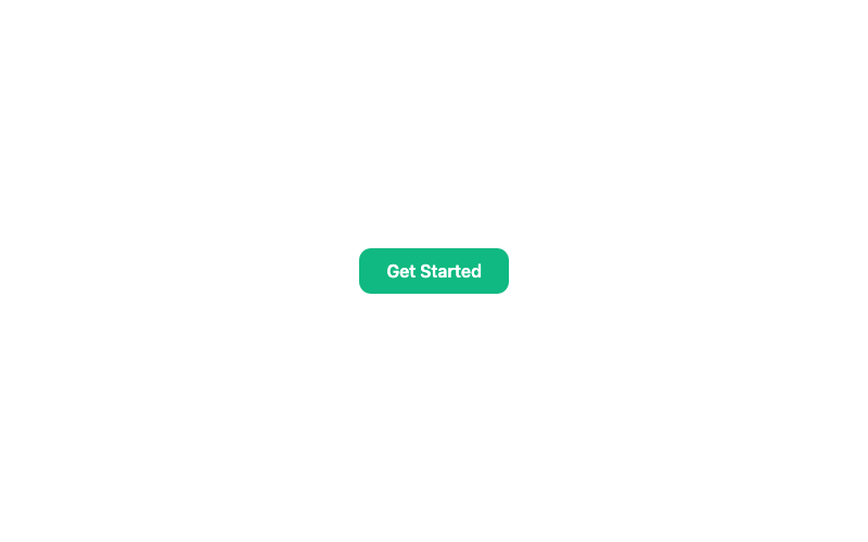
Loading Button
A button that shows a spinner and disables while pending.
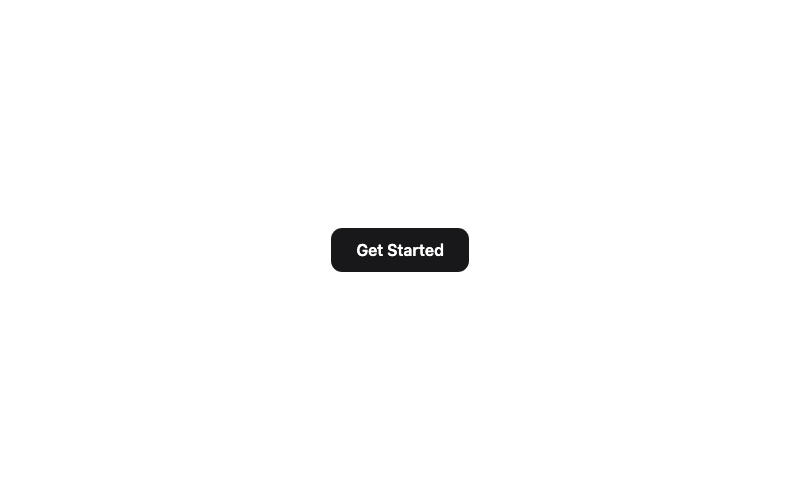
Shine Button
A button with a sweeping shine highlight on hover.
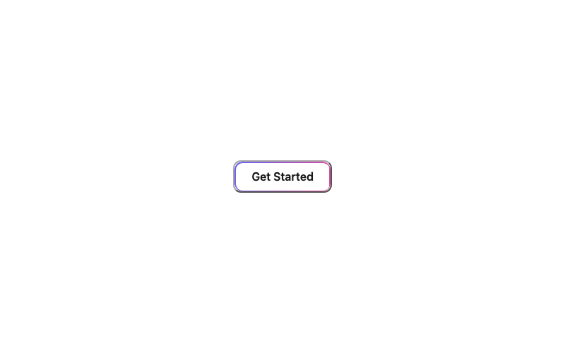
Gradient Border Button
A transparent button framed by a static gradient border.
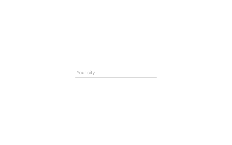
Underline Input
A borderless input with an animated underline.
 Featured
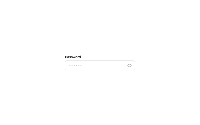
Password Toggle Input
A password field with a show/hide eye toggle.
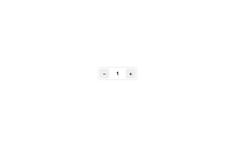
Number Stepper
A quantity input with plus/minus buttons.
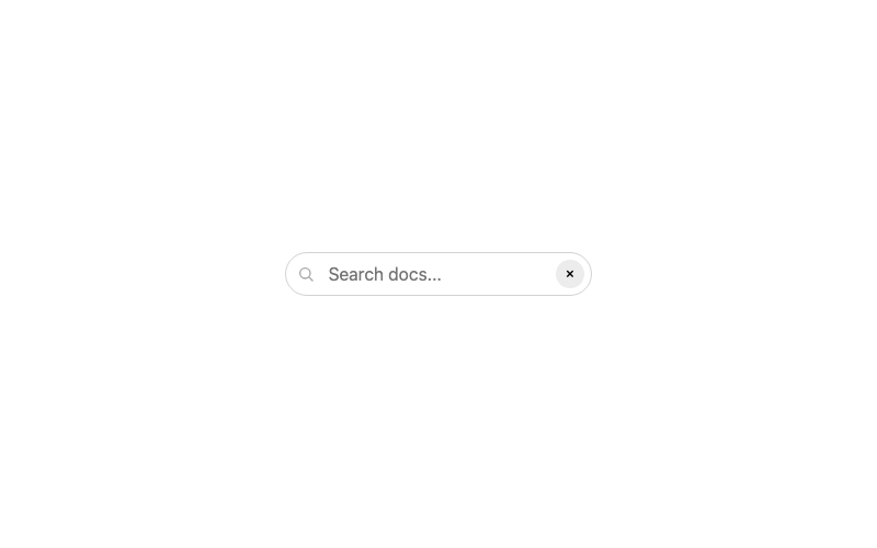
Clearable Search Input
A search input with a one-click clear button.
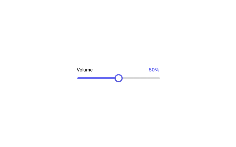
Range Slider
A styled range slider with a live value readout.
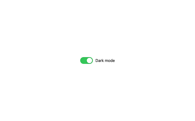
iOS Style Toggle
The pill-shaped iOS toggle with an inset shadow.
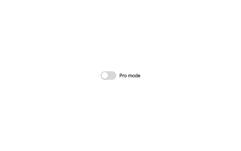
Gradient Toggle
A toggle with a vivid gradient fill when enabled.
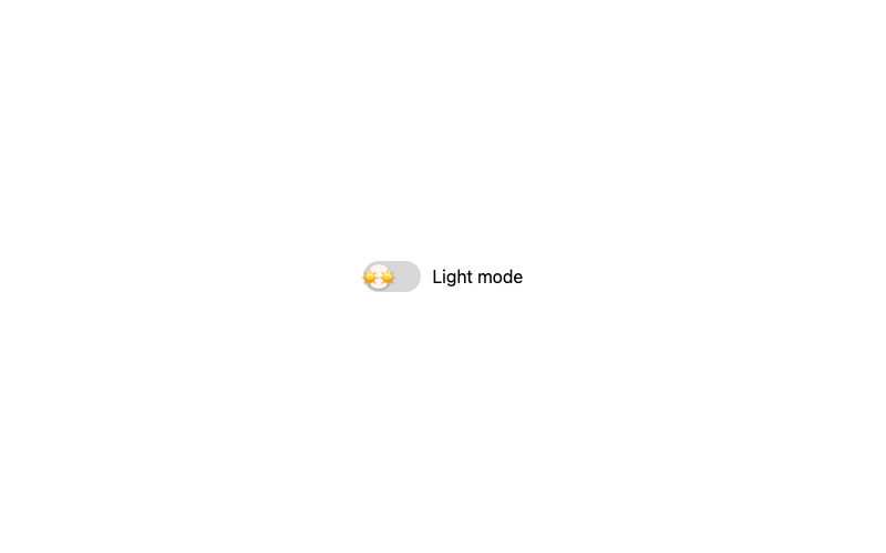
Emoji Toggle
A playful toggle whose knob shows an emoji.
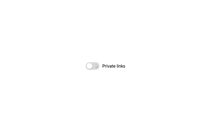
Icon Toggle
A toggle that shows an icon inside the track.
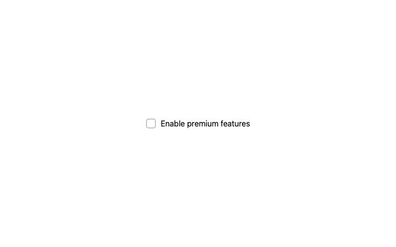
Gradient Checkbox
A checkbox that fills with a gradient when selected.
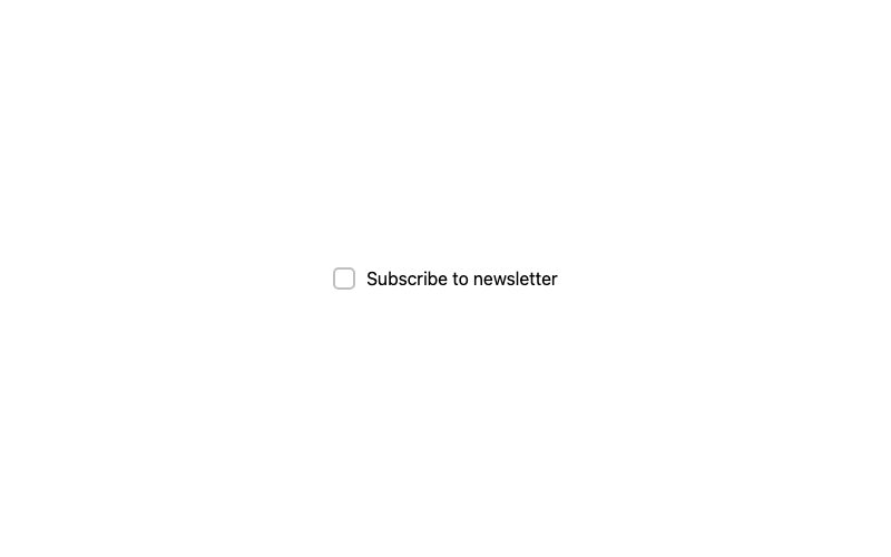
Animated Pop Checkbox
A checkbox with a springy pop when selected.
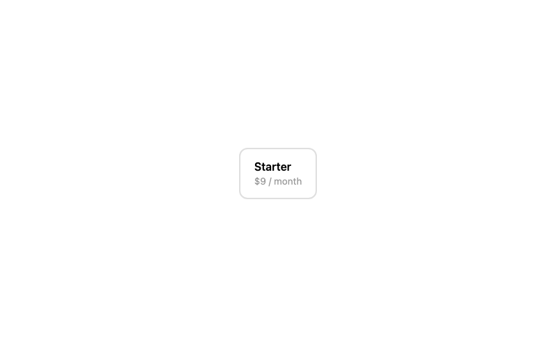
Checkbox Card
A selectable card with a checkmark in the corner.
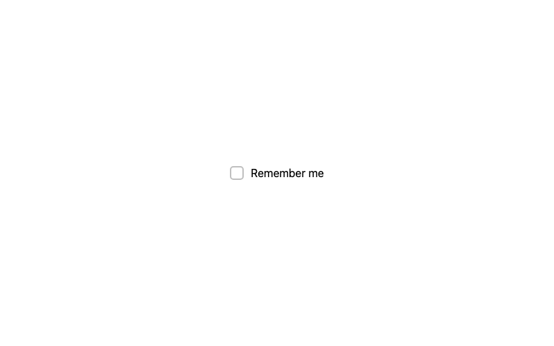
Hover Reveal Checkbox
A checkbox that previews its checkmark on hover.
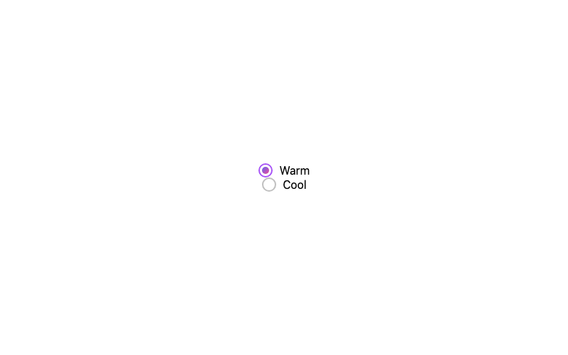
Gradient Radio
A radio whose selected dot is a gradient.
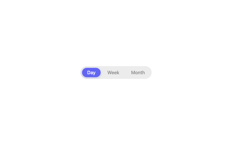
Pill Radio
Segmented-control pills that fill when selected.
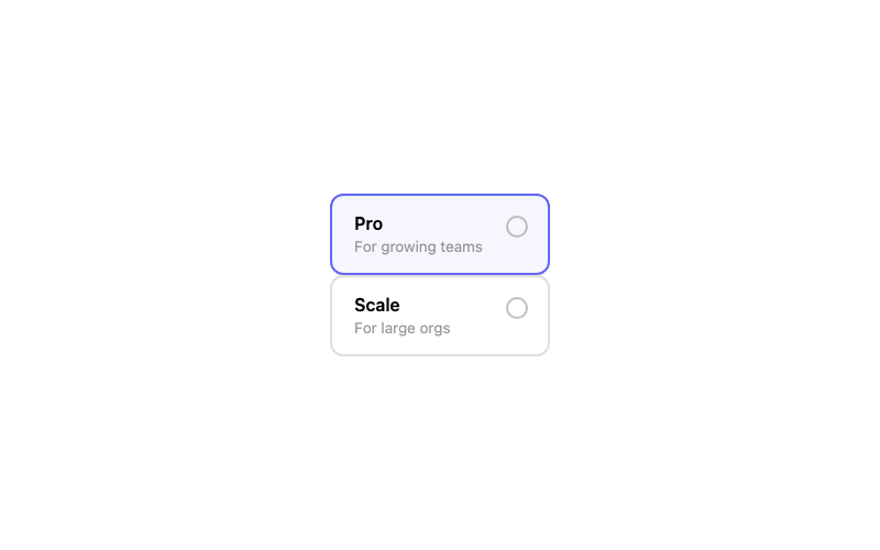
Radio Card
A selectable pricing card controlled by a radio.
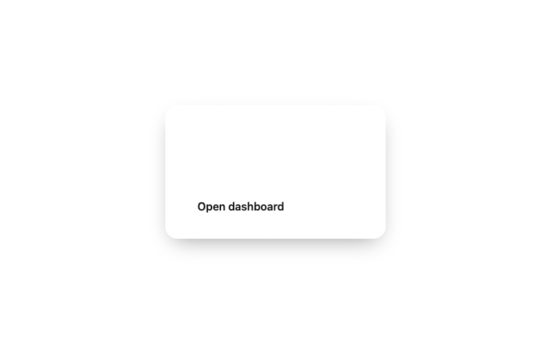
Glass Card
A frosted glass card for overlays and heroes.
 Featured
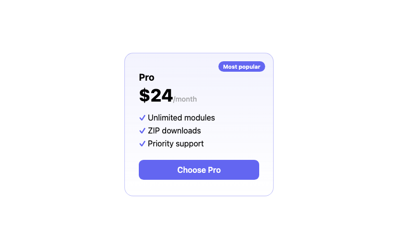
Pricing Card
A pricing card with a highlighted 'popular' tier.
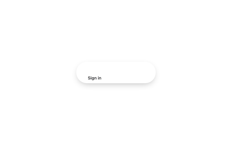
Glass Navbar
A frosted-glass navbar for dark heroes.