Search the library
99+ production-ready modules. Find your next component.
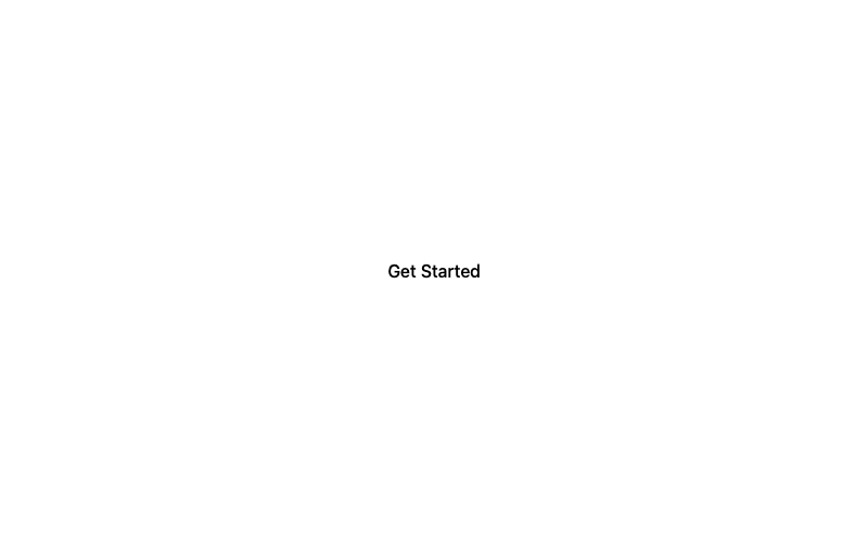
Minimal Button
A clean, borderless button with a subtle fill on hover.
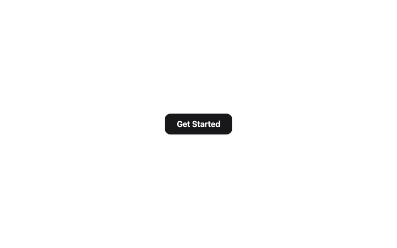
Modern Button
A rounded button with a soft shadow that lifts on hover.
 Featured
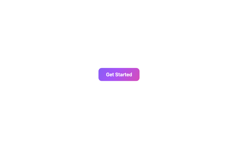
Animated Gradient Button
A button with a flowing animated gradient background.
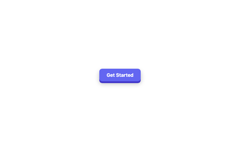
3D Button
A chunky 3D button with a pressed-down active state.
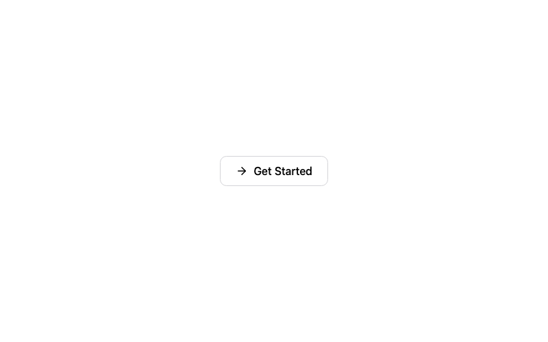
Icon Button
A button with an arrow icon that slides on hover.
Ghost Button
A borderless button that fills softly on hover.
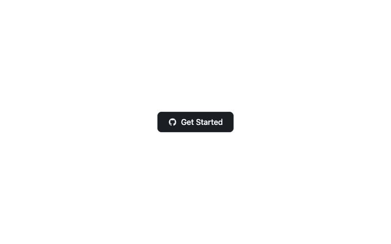
Social GitHub Button
A GitHub-branded button with the octocat mark.
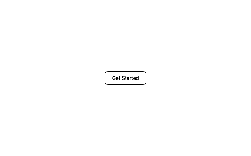
Outline Button
A classic outlined button with a filled hover state.
Loading Skeleton Button
A skeleton placeholder button that appears to load.
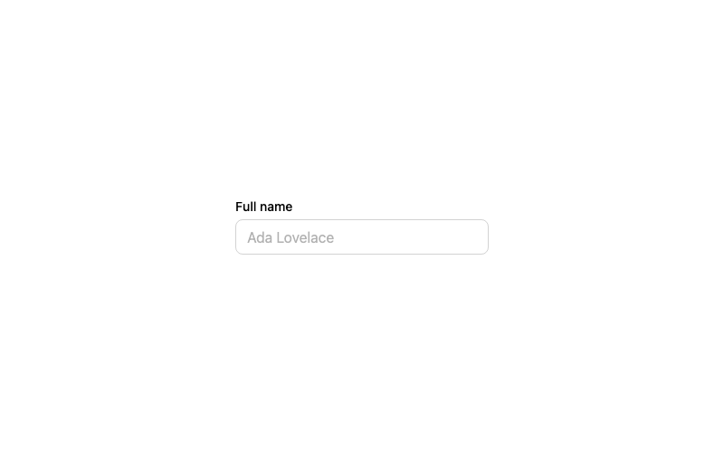
Default Input
A standard labeled text input with a focus ring.
 Featured
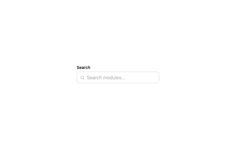
Icon Input
A search input with a leading magnifier icon.
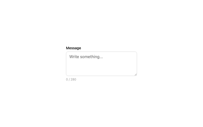
Textarea
A resizable textarea with character counter.
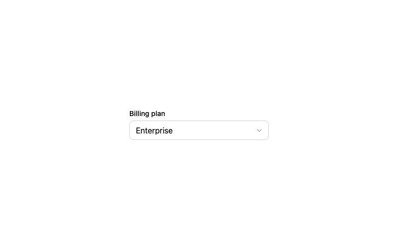
Custom Select
A styled dropdown select with a chevron.
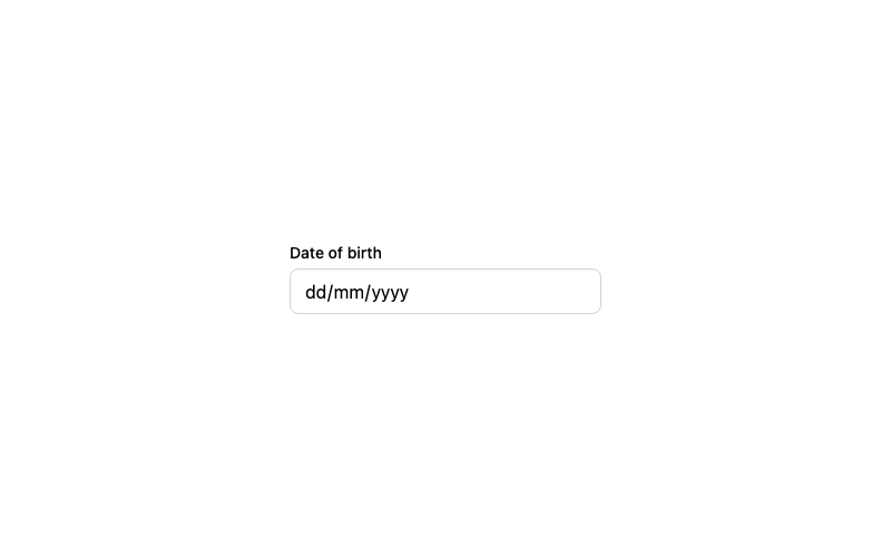
Date Input
A styled native date picker input.
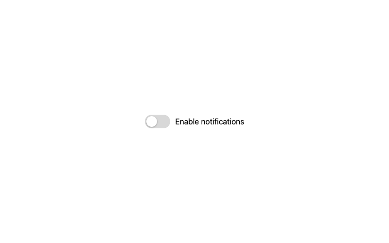
Classic Toggle
The standard green toggle switch with a sliding knob.
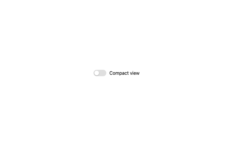
Minimal Toggle
A quiet, low-contrast toggle for toolbar UIs.
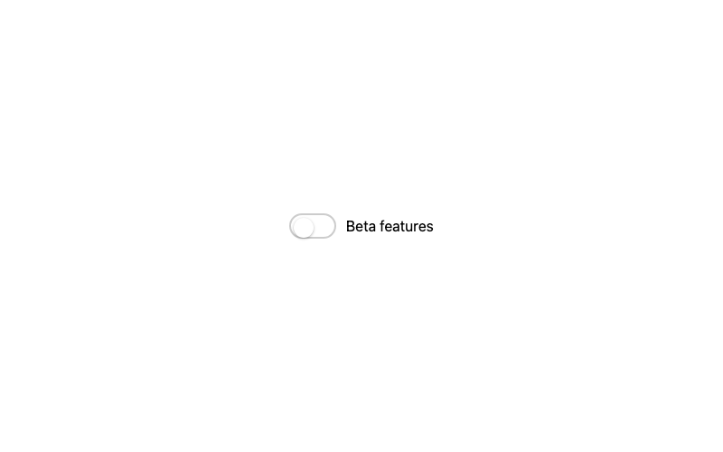
Border Toggle
A toggle outlined with a soft border, filled on check.
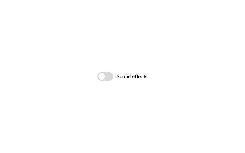
Animated Knob Toggle
A toggle with a bouncy spring knob animation.
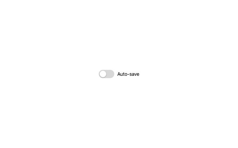
Scale Toggle
A compact toggle that scales up when focused.
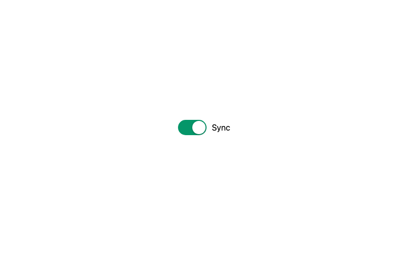
Solid Color Toggle
A bold toggle with a saturated on-state.
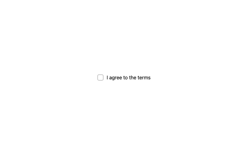
Default Checkbox
A standard checkbox with a crisp checkmark.
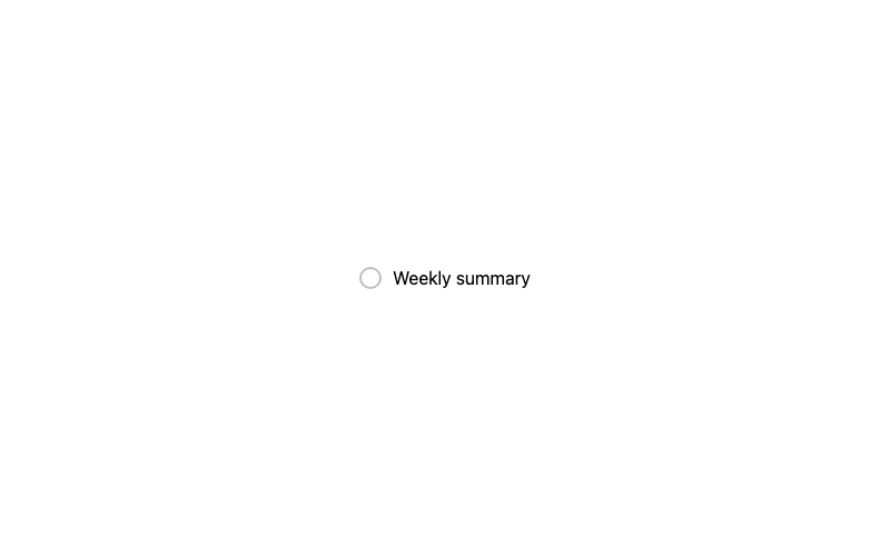
Rounded Checkbox
A fully circular checkbox.
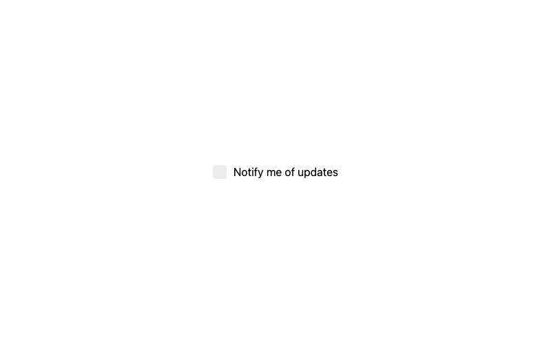
Minimal Checkbox
A borderless checkbox that only shows on selection.
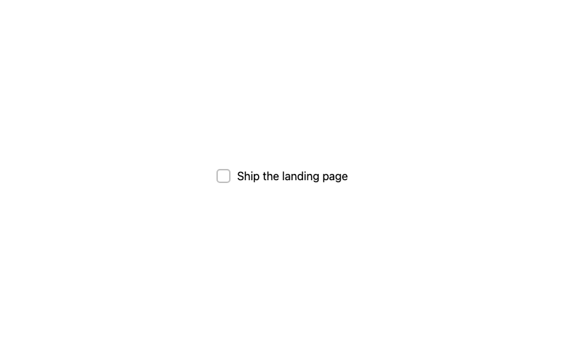
Label Strike Checkbox
A todo-style checkbox that strikes through its label.